A tool to give small words a big voice

Client: Personal project
Saucy Snippets is a handy tool for people who create products. This website is a collection of written quips, instructions, and messages that product designers can incorporate into their work to add clarity or emphasis to banal interactions. I’ll take you behind the scenes of why and how I created this site.


My Role: UX, UI, UXW, 3D, Web Dev.

Project Type: Website
A tool to give small words a big voice
Client: Personal project
My Role: UX, UI, UXW, 3D Web Dev.
Project Type: Website

Saucy Snippets is a handy tool for people who create products. This website is a collection of written quips, instructions, and messages that product designers can incorporate into their work to add clarity or emphasis to banal interactions. I’ll take you behind the scenes of why and how I created this site.
Turning the temperature up on “lorem ipsum”
Throughout my career, I have worked on many different types of projects and across multiple industries. I began my career as a graphic designer, focusing on printed media. After nearly 20 years, I’m now exclusively dedicated to digital products. The one thing that has been consistent throughout my journey is that writing is difficult for designers and we often try to dodge it using different tactics.
“Lorem ipsum” and traditional copywriters certainly have a place and play a crucial role in the product design process. But to all the other incidental interactions that require written text when designing experiences—from confirmation messages, to error text, there’s opportunity to enhance the user experience of products that turn ordinary into delightful. That, right there, is why I created Saucy Snippets.
No doubt, I’ve honed my writing skills over the years all in service of being able to produce better products for my clients. This website is an opportunity for me to share some of these skills with the product design community and help anyone turn short words into big sensations.
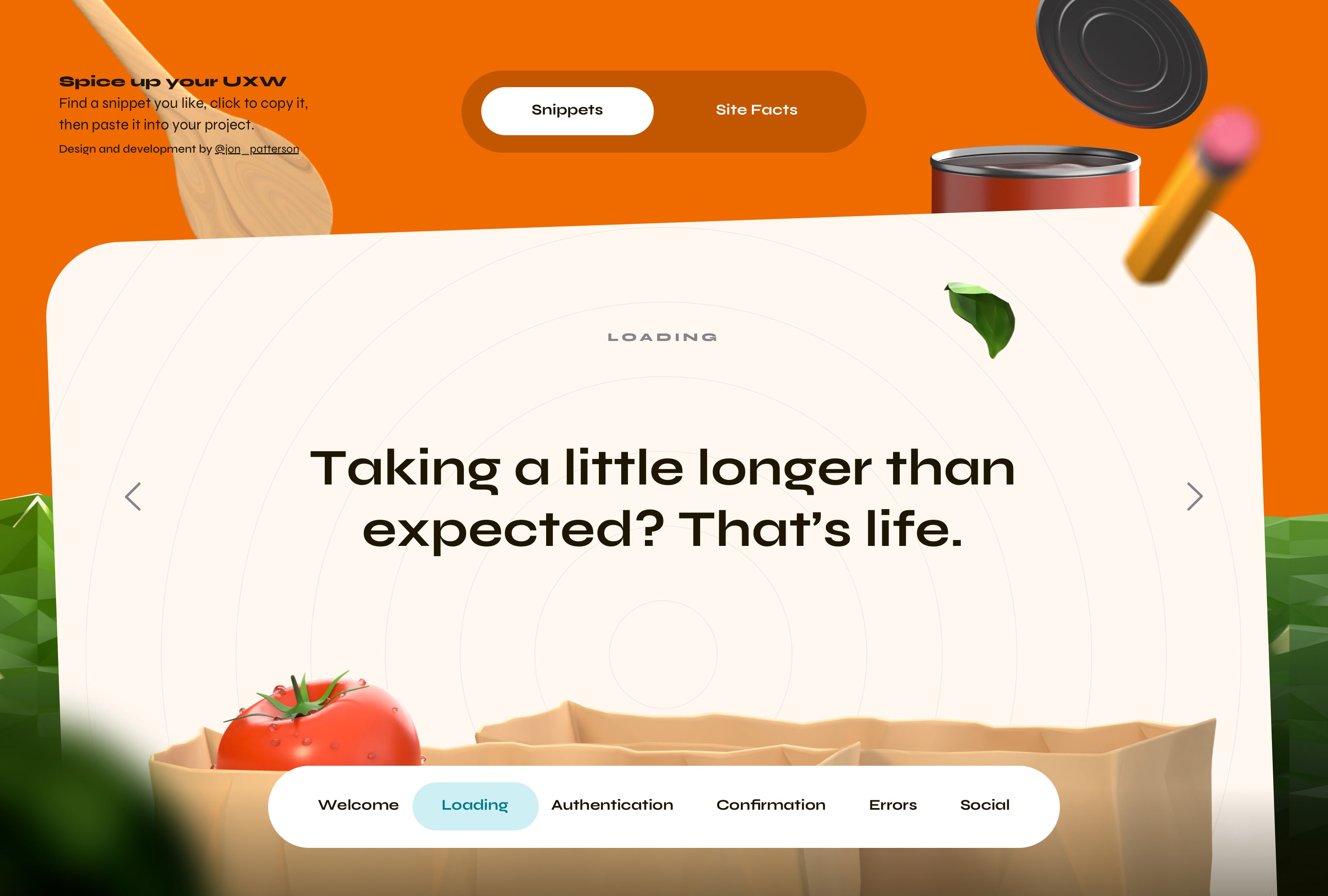
Snippets: The primary screen a viewer interacts with to find inspiration
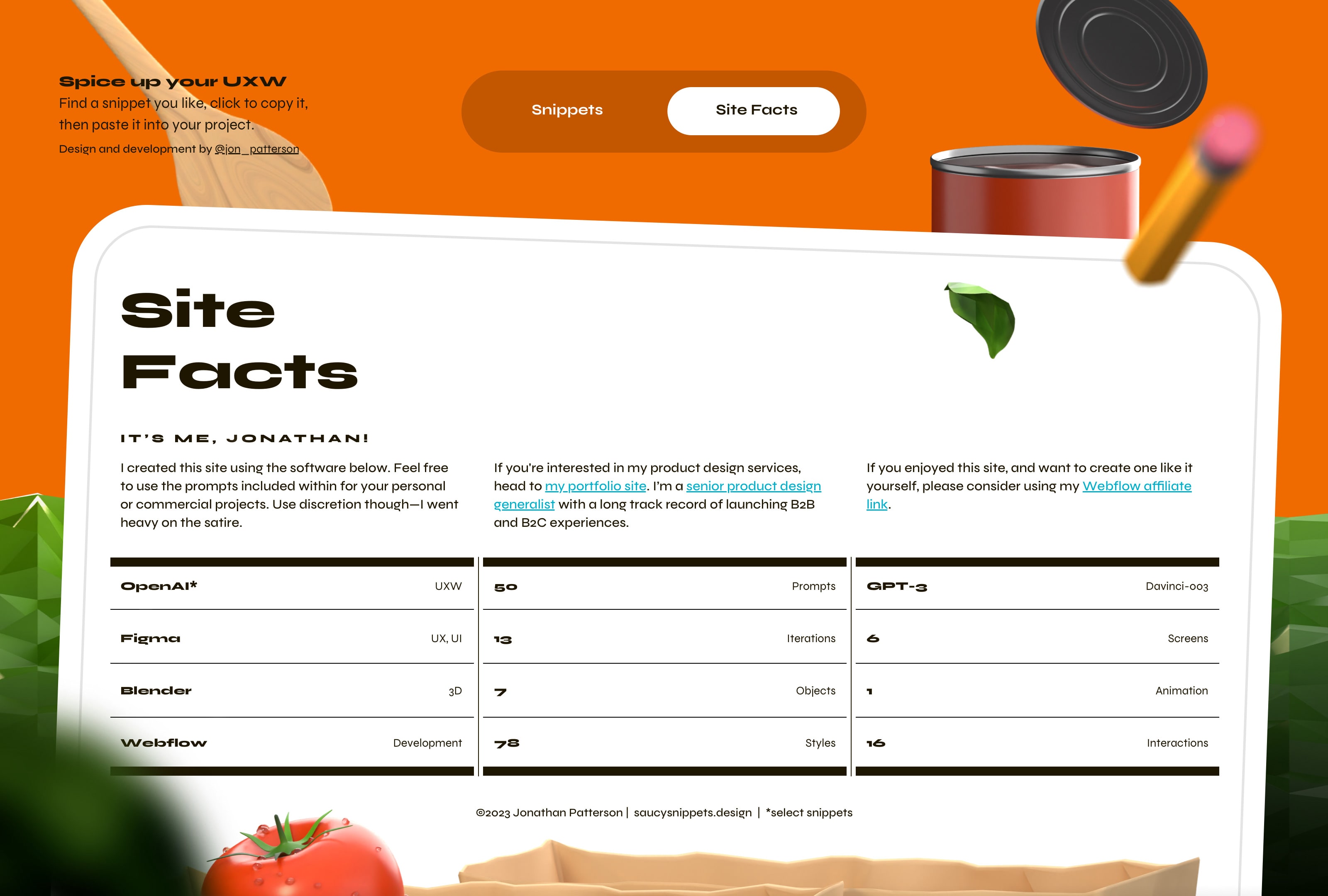
Site Facts: A granular view of the software used to create the website
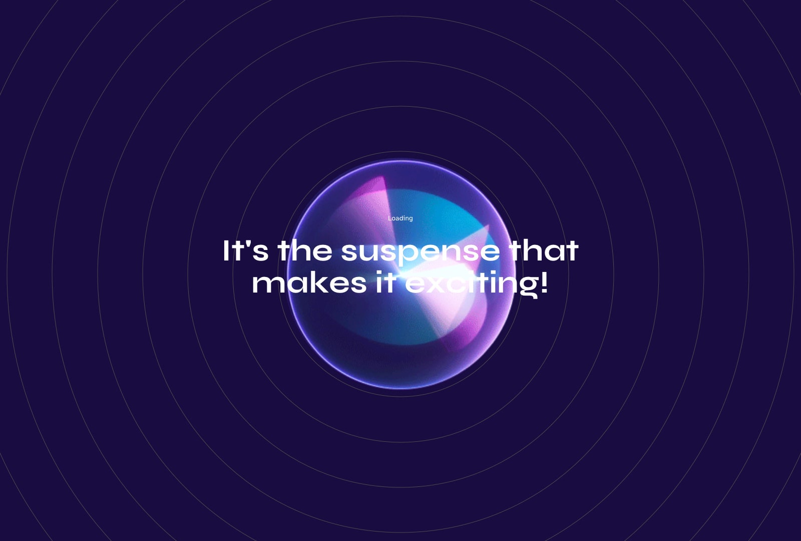
A taste of what’s in store
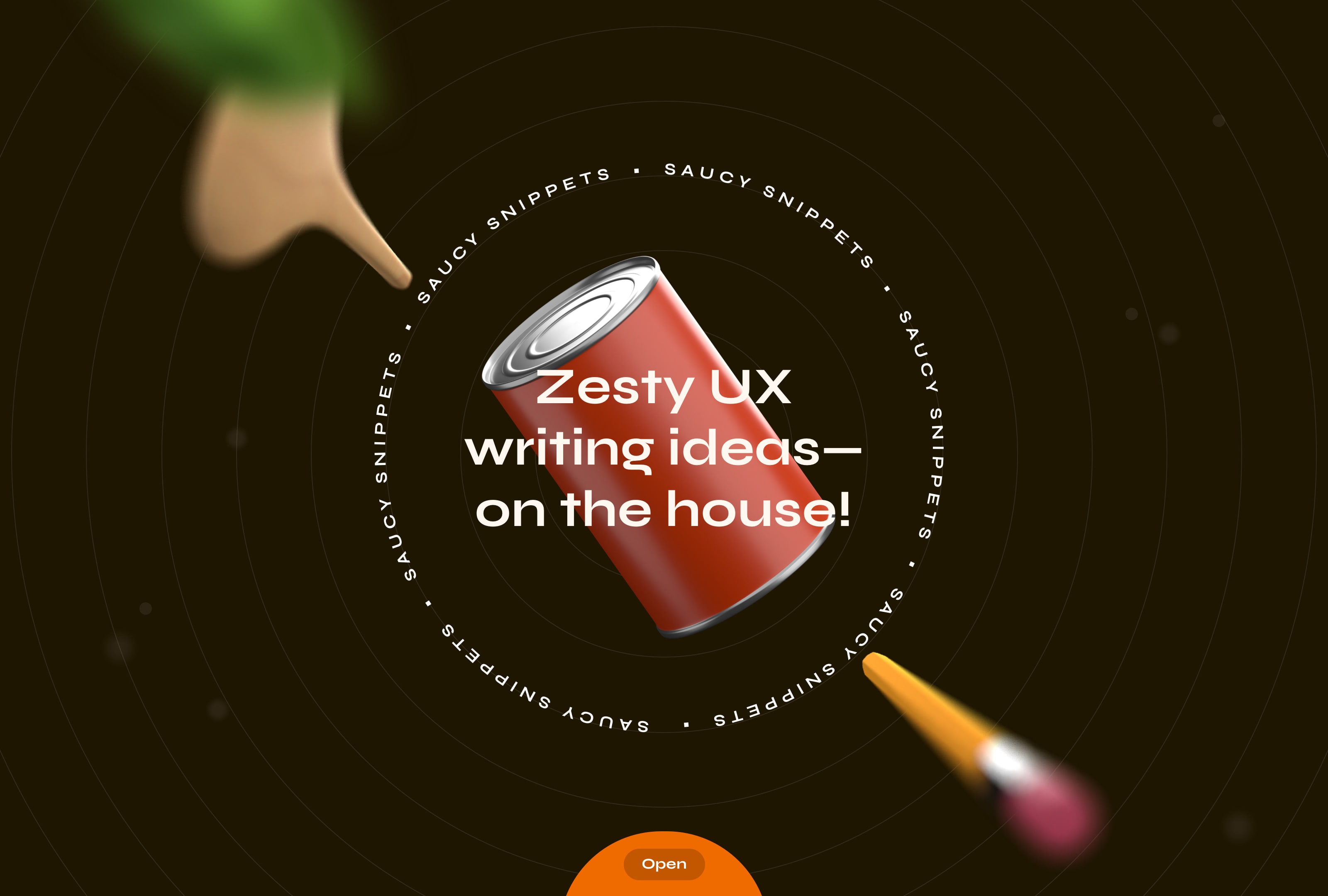
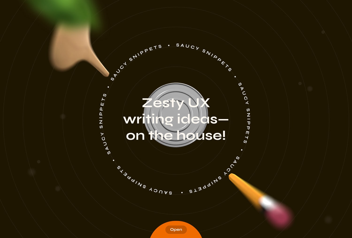
The Intro Screen
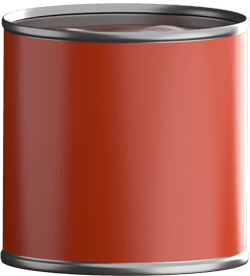
Often I find that design driven by a strong theme has the most welcoming effect, and this influenced my creative process significantly. Pair that with the idea of creating a resource for writing with a punch and voila—a lively food-inspired design was conceived. Exploring multiple conceptual directions, I ultimately chose the one that felt best. To demonstrate this concept, a can of nondescript sauce floats in the middle of the screen with relevant objects orbiting it to create the perfect blend of food and writing elements.
Depth of Field
By incorporating a sense of depth I created an experience that was anything but flat, which is usually the case with websites. To amplify this, the elements closest to the viewer are defocused.
Parallax
As the user moves the mouse across the screen, the basil leaf, spatula, and pencil all exhibit distinct motion speeds, mimicking how our eyes perceive objects moving closer or farther away in reality.
Animation
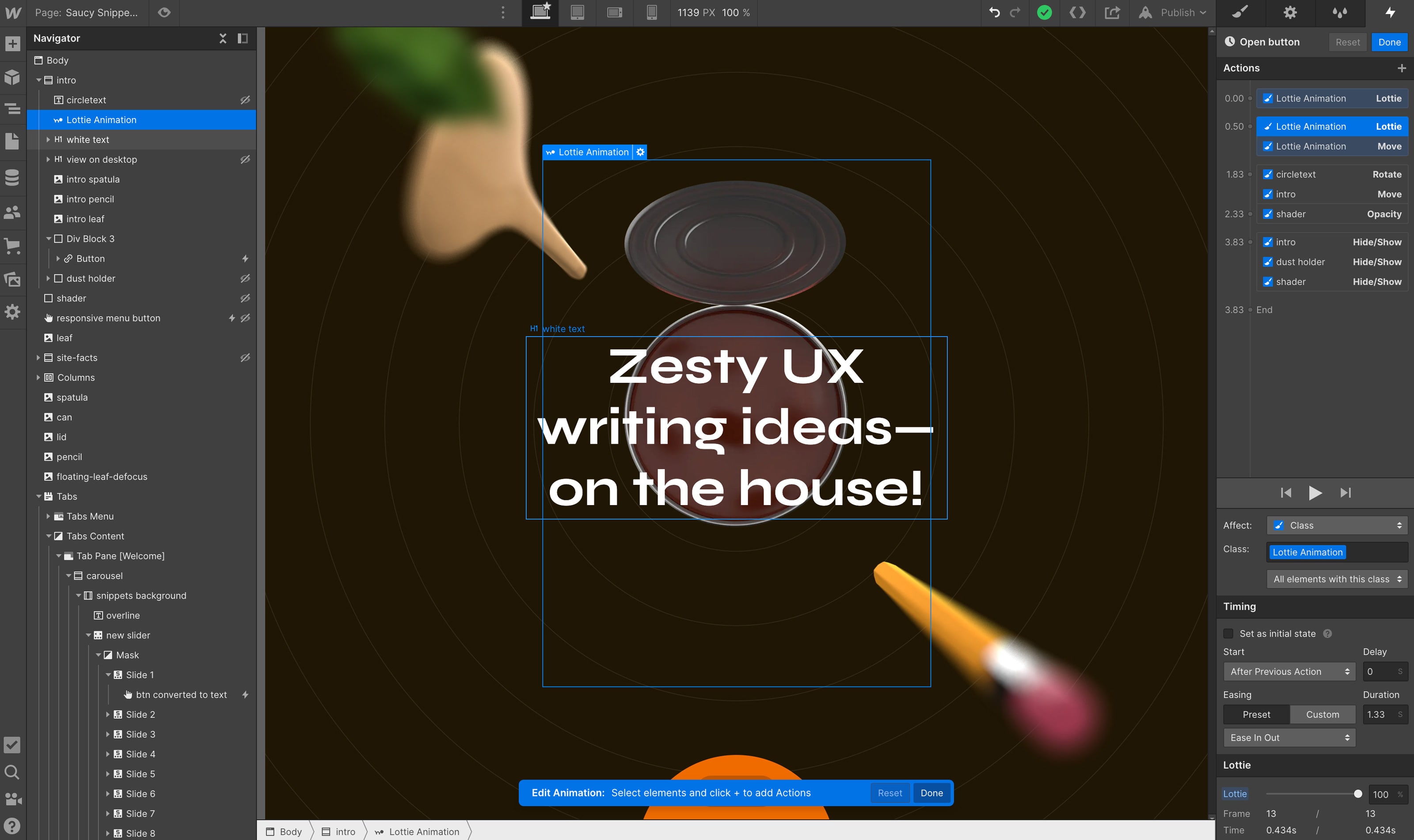
Interactivity really brings the food theme to life. When the viewer clicks on the ‘Open’ button the can rotates to reveal its saucy contents, after that, the home page seamlessly transitions to the next screen.
Animation: The lid of the can rotated into view
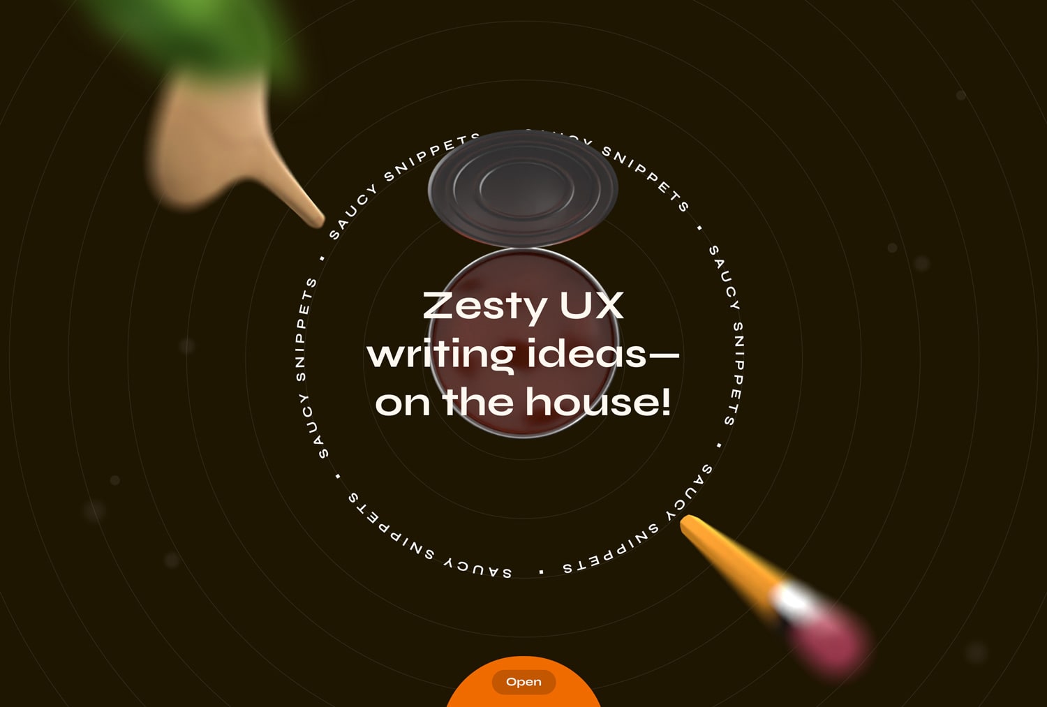
Animation: The can animation sequence concludes with the can opening
Top Navigation
Demonstrating that less really can be more, this navigation communicates how to use the site, what it can be used for, and how I created it in just one sentence plus two tabs for viewers to navigate to. Additionally, I excluded a button to return to the home page since there is little need for that after you’ve seen it once.
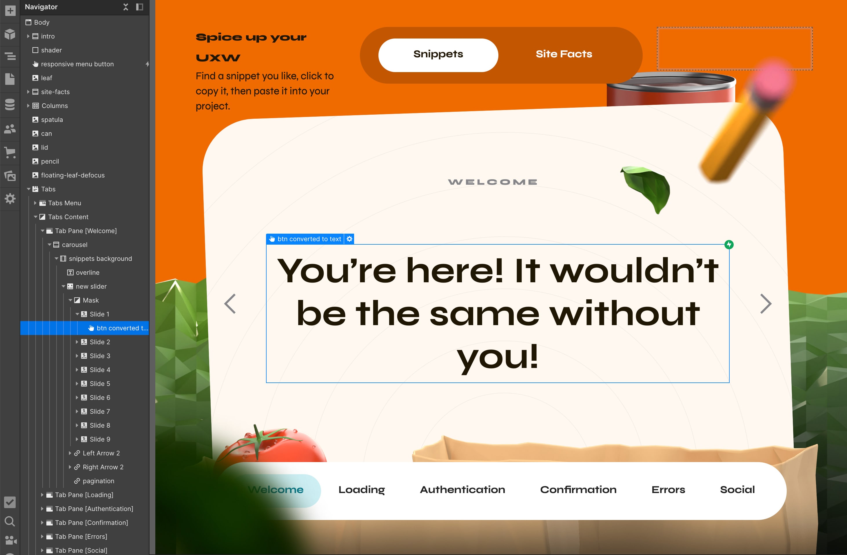
Center Content
It doesn’t take long for a guest to get what they came for, and the center area does exactly that. Each snippet occupies the entire space to give the viewer ample opportunity to take it in. The arrows at either side of the section operate the carousel, revealing an untold number of options from which to click to copy.
Bottom Navigation
A site dedicated to the vernacular nuances a product designer might be tasked with writing added an element of difficulty. I avoided conflating these categories with instruction on how to use the website by moving each of them to the bottom of the screen, far from the primary navigation.
Click to copy: The resting state of the snippet is solid and dark
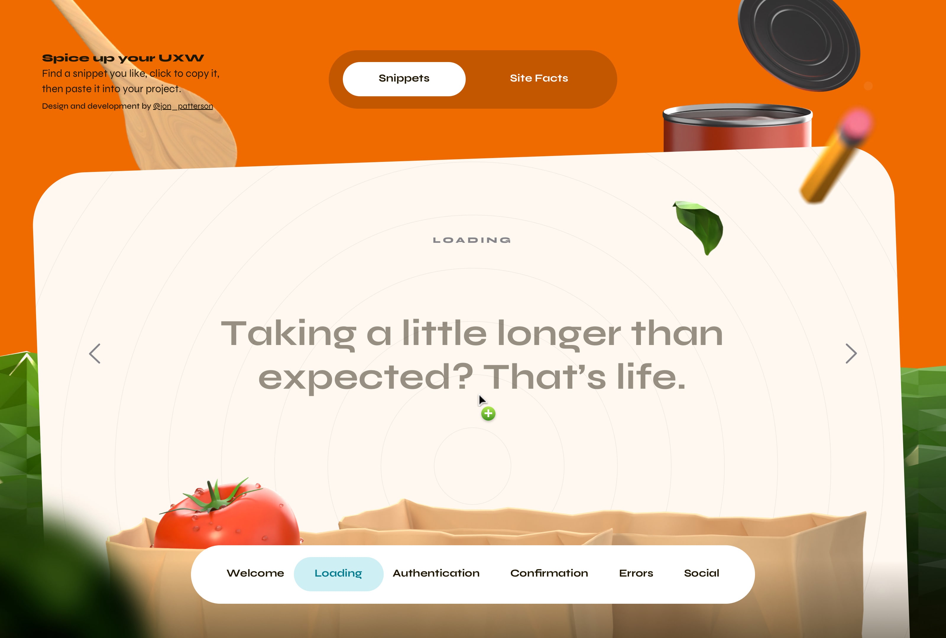
Click to copy: On hover, the cursor changes to a plus symbol and on click, the snippet dims while text is copied
A healthy helping of snarky prompts
“Wrong again?, maybe this isn’t your account after all” and “Come on, give in and just hit Like” from the ‘Authentication’ and ‘Social’ sections respectively are just two examples of many snippets that I thoroughly enjoy. That said, I created this website with an abundance of satire. As the title implies, some of the content is quite spicy, so I advise fellow product designers to be mindful when incorporating them into their own designs, or to just enjoy them for what they are.
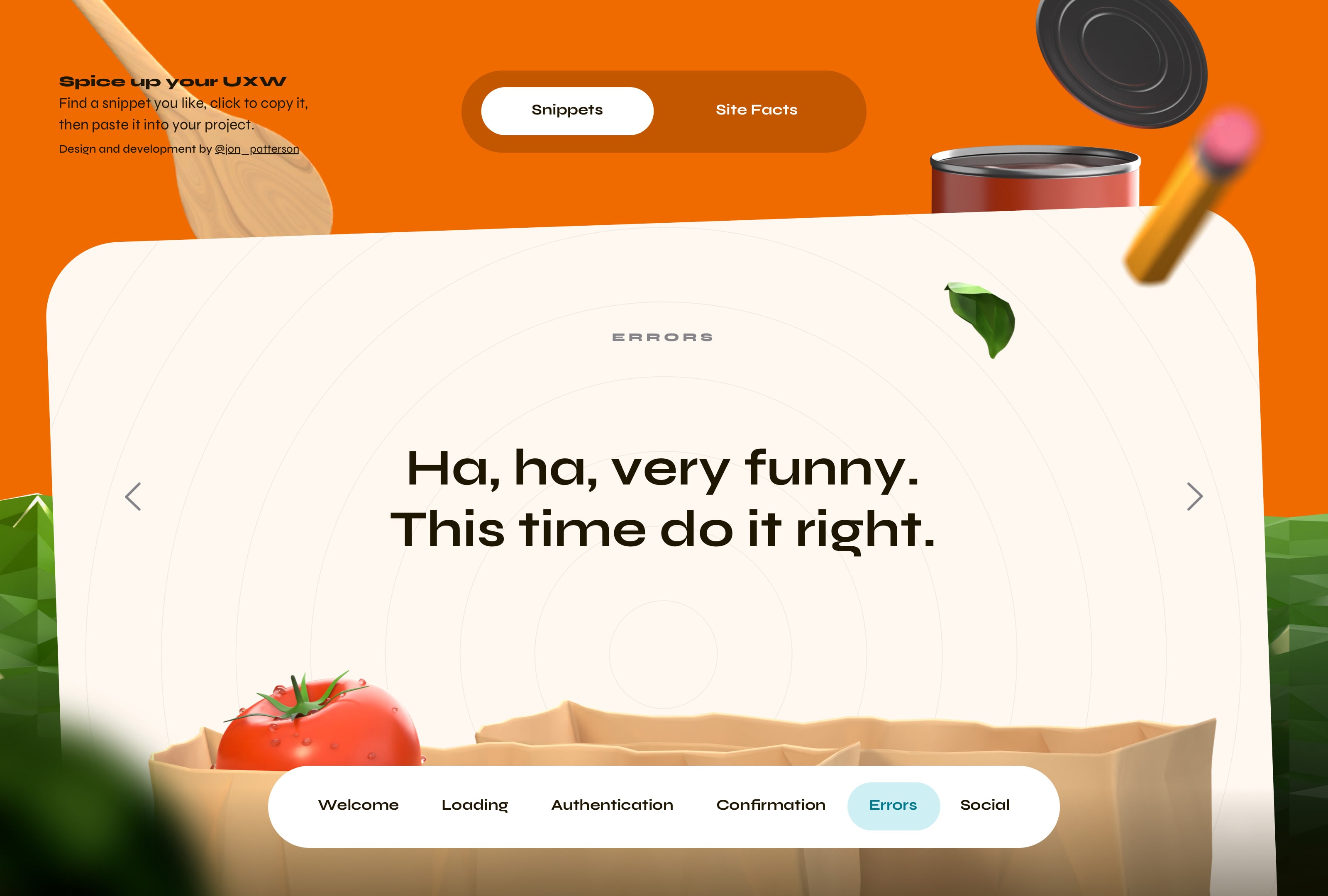
Snippet: ”Ha, ha, very funny. This time do it right.” is a personal favorite from ‘Errors’ section
A dash of this, a pinch of that
In the process of creating this website I explored nearly a dozen conceptual and visual approaches. Naturally, my objective was to create a cohesive experience. What began as a website with an artificial intelligence vibe slowly morphed into the design you just saw. And, taking inspiration from many places, I had recently watched a short movie called
Robin, Robin which inspired me tremendously. In the end, refinement meets fantasy in the crafted composition.
Concept: One of nearly a dozen design concepts I explored
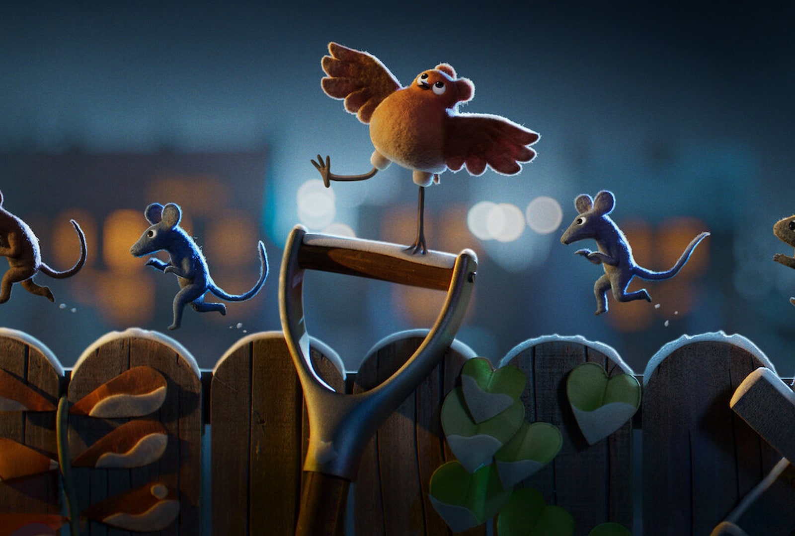
Inspiration: A still frame from the movie Robin, Robin which heavily inspired my creative process
Software Behind the Design
I used a variety of tools to pull this concept off. The site was designed in Sketch and Figma. After that, I used OpenAI (who isn’t these days, right?) to create many of the snippets. Though I added my own flavor where needed. From there I took to Blender to create the 3D components—each of them are modeled by Yours Truly (that’s me.) Last, I used Webflow to stitch everything together, which I’ll cover a bit more in a second. The Site Facts screen below provides viewers with more granular detail in case they want to create an inspired experience of their own.
Site Facts: More granular details on the software i used to create this resource for product designers
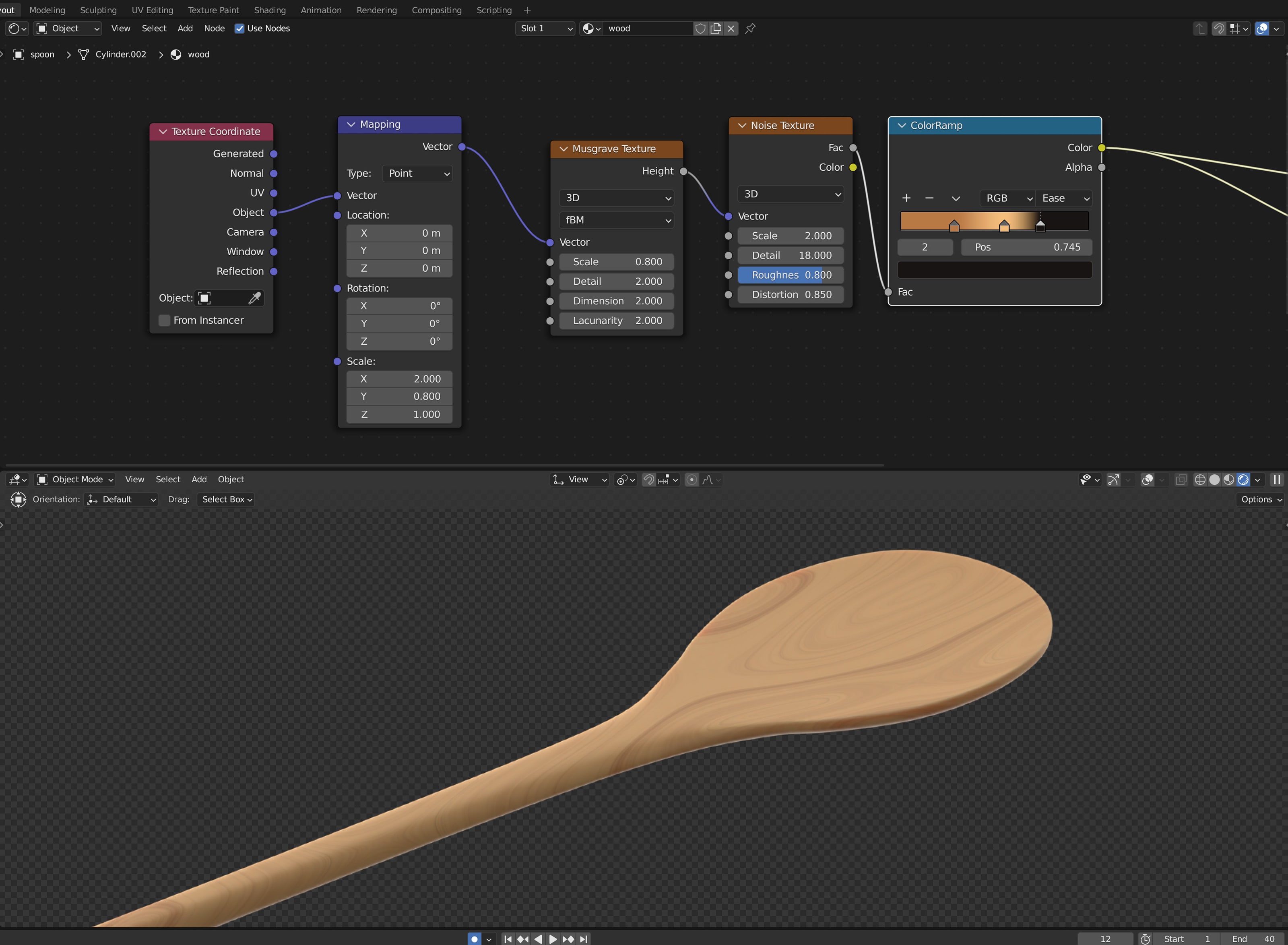
Blender: Here, I modeled a spatula and used a procedural texture to create the look of wood
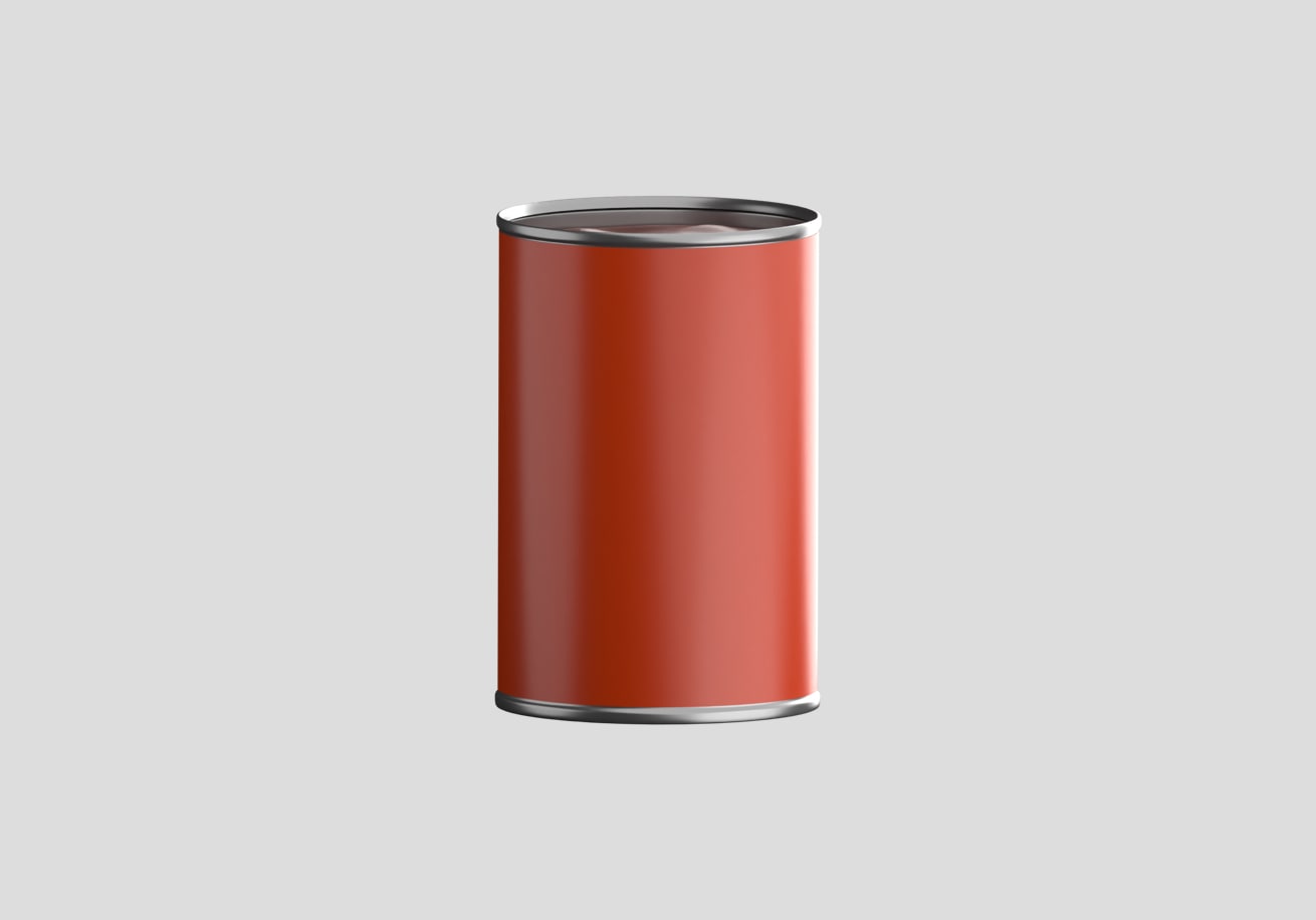
Blender: A fully-rendered view of the main 3D can
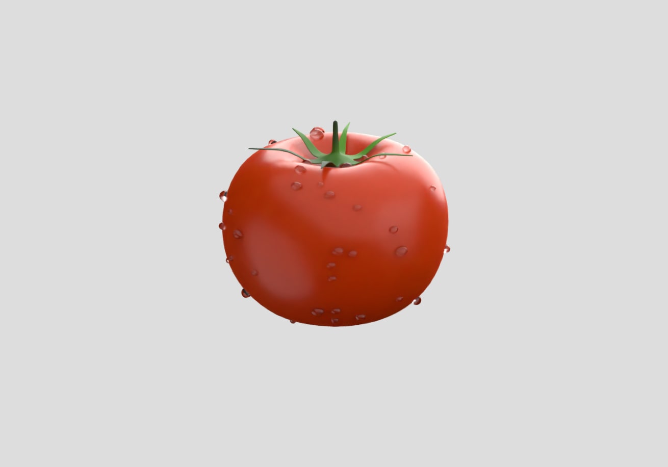
Blender: A fully-rendered view of the tomato with algorithmically placed water droplets
From Design to Development
The rise of what-you-see-is-what-you-get web builders is undeniable; however, they often do not meet the standard of a professional designer, or involve a steep learning curve. Even so, I chose Webflow to develop this project and completed it in just over one week.
Outliner and Canvas
For anyone who’s familiar with design software Webflow’s Outliner and Canvas use similar concepts. The Outliner is tantamount to a layer stack, while the Canvas is where design happens. Piece by piece I recreated my static design in Webflow.
Interactions and Lottie
The movement and interactions that occur within Saucy Snippets make it an enjoyable experience. I exported images and asset sequences from Blender to use in Webflow, adding timed animations and transitions, on-mouse events, and other interactions.
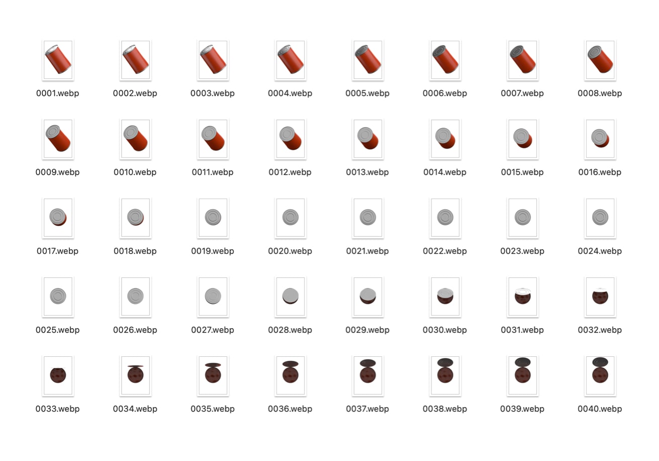
Asset sequence: A series of images exported from Blender
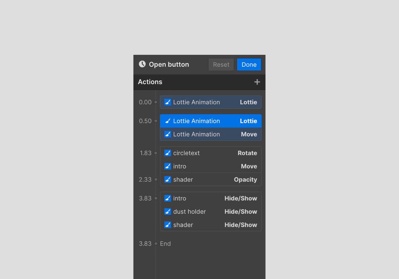
Webflow: A closeup view of timeline-based animation
Webflow Outliner and Canvas: The Outliner (left) with various objects and assets. The right displays the Webflow Canvas where designs are built.
Remarks
In the end I created a tool providing prompts for product designers to use as-is, or to get their creative juices flowing. Finally, here’s where I make the most of fewer words…
Insights
I originally considered dynamically generating snippets using OpenAI, but AI was only a means to an end, and not the concept itself. The simple things have a way of being difficult to pull off, but being persistent in my vision of creating a curated resource for product designers enabled me to create the best solution.
Challenges
Despite the ease with which Webflow enables designing for different breakpoints and screen sizes, I had to scrap the mobile version due to some technical limitations. When considered alongside the primary device use case of this tool—desktops—the return on investment was not significant enough.
Up Next
AI-Powered Content Distribution for Publishers