You’ve probably read all the literature about how to create a solid investor pitch; have a clear value proposition, demonstrate your go-to-market strategy, don’t show complicated imagery, avoid cramming too much info into each slide… the list goes on. However, as we all know, putting theory into practice is often easier said than done, right?
Crafting the investor pitch.
I’m a product design generalist who’s been in the trenches with tons of startups and big-name companies for nearly 20 years. One thing I’ve learned? Effective design starts with knowing your audience. And right now, we’re talking about catching the eyes of potential investors. I’ll focus on what makes them sit up and take notice: your big vision, and how to use design to sharpen your pitch’s core message. Presenting to customers? That’s a different game—I’ll save those tips for another day.
Time is of the essence.
In a pitch, every second counts. Sometimes, you’ve only got 2 minutes to excite investors, other times you’re lucky to get 20 minutes to dive deep. And in a lineup of many startups, expect the quick-hit version. Let’s kick off with the must-have slides no matter the time limit. Toward the end, I’ll circle back to a few more that are equally important, but might be overkill when time is short. So, here’s how to turn design and pitch deck best practices into the funding you need!
Set the tone from the very first slide.
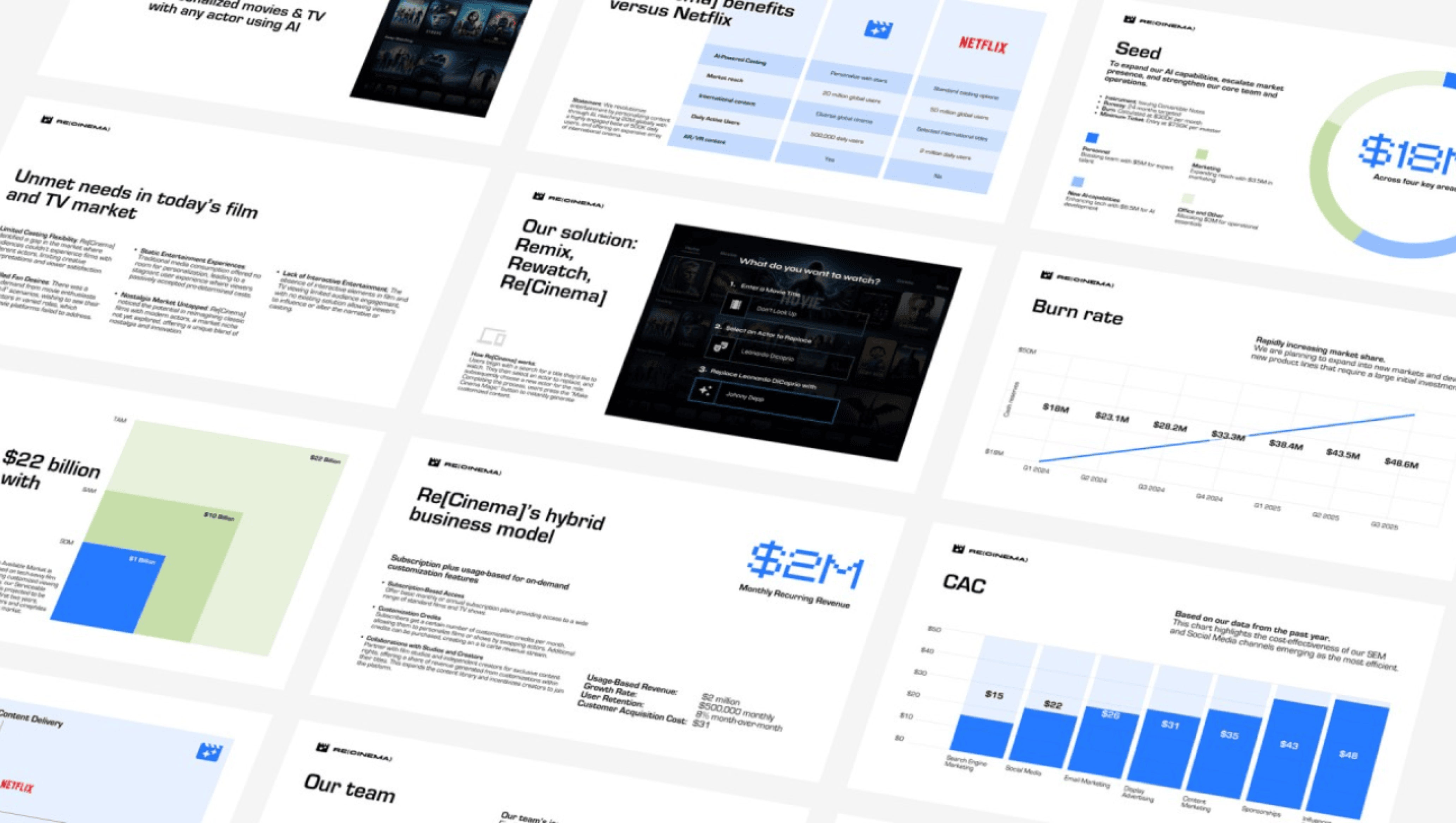
This is where you drop your company name, and a crisp one-liner about what you do. It’s your value proposition. Think words, without the marketing spin. For this pitch, I’ve imagined a fictitious company called Re[Cinema]. It allows users to choose actors for any film or TV role. This technology personalizes viewing experiences by altering existing movies and shows with different stars.
With that, now’s a good time to share a design fundamental: stick to one or two fonts throughout your deck. Or, choose one versatile font with a range of thicknesses. This’ll keep your slides varied, yet cohesive.
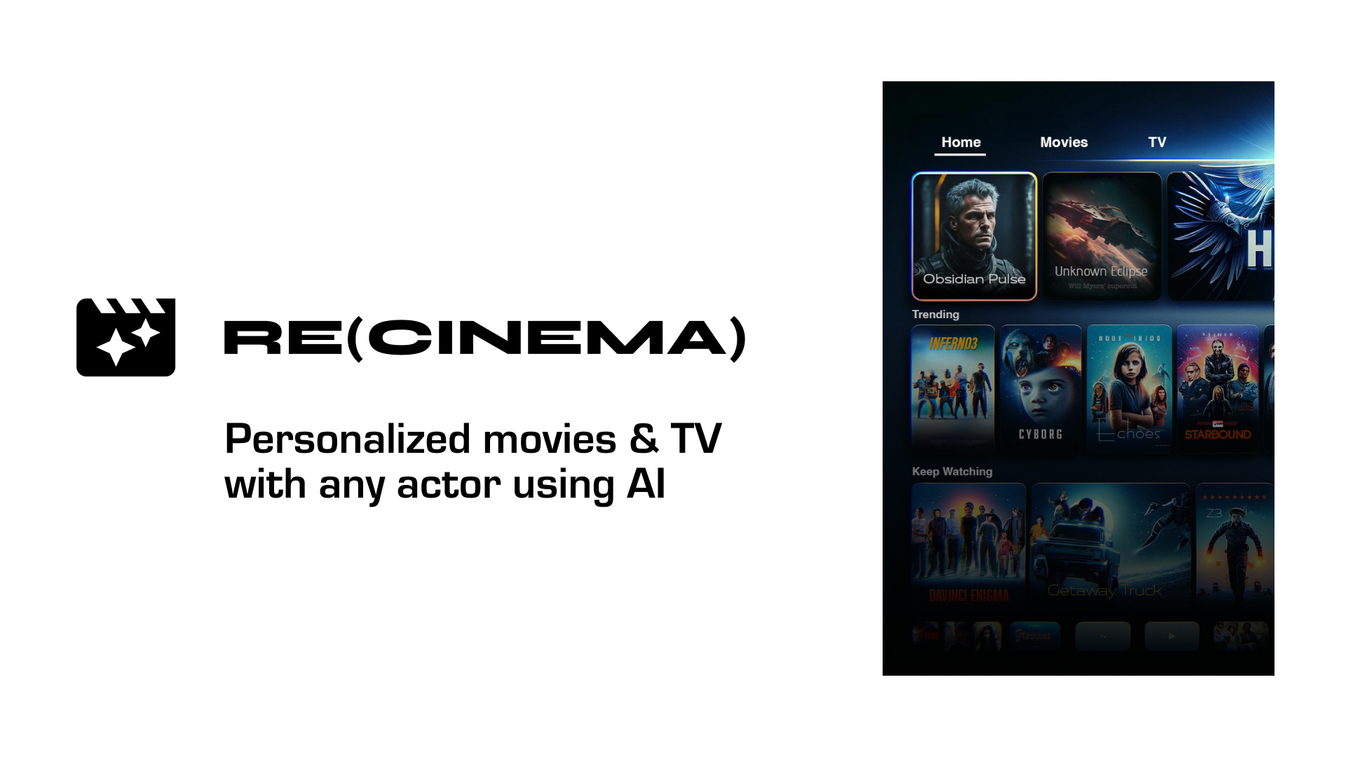
See what I did there? Now, let’s pivot to another core design principle, taking a cue from Re[Cinema]’s identified problem.
Ever been told to just focus on content and forget about design? Well, I’m here to tell you that design’s role is not simply to make things look pretty, but to also enhance comprehension. In investor pitch decks, over-designing is a common affair. But guess what? Under-designing won’t do you any good either. Text haphazardly strewn about the slide is confusing. Information and design work together to give you the best of both worlds. They help investors understand and remember your pitch.
So, let’s put this into action. Early on in your pitch, you’ll typically outline the problem your startup has identified. This is where you also subtly hint at the solution you’ll fully unveil later. The slide below demonstrates how.
The text is evenly spaced and large enough to read, without covering every single inch of space. Try dividing your slides into sections: halves, thirds, and quarters are simple layouts that look good and make information easy to understand.
We’ve got the intro in the bag, let’s set the stage for the solution.
Remember, clarity is king in presentations—keep that front and center in your mind. If you have some traction already, this is a good place to show it with a slide. (Refer to my more detailed advice on chart design further down. We’ll get there, but let’s not jump ahead just yet.)
Investors want clear business value, not just technical details. Now, I’ll walk you through visualizing your startup’s reach and the problem you’re solving in a way that hits home for them.
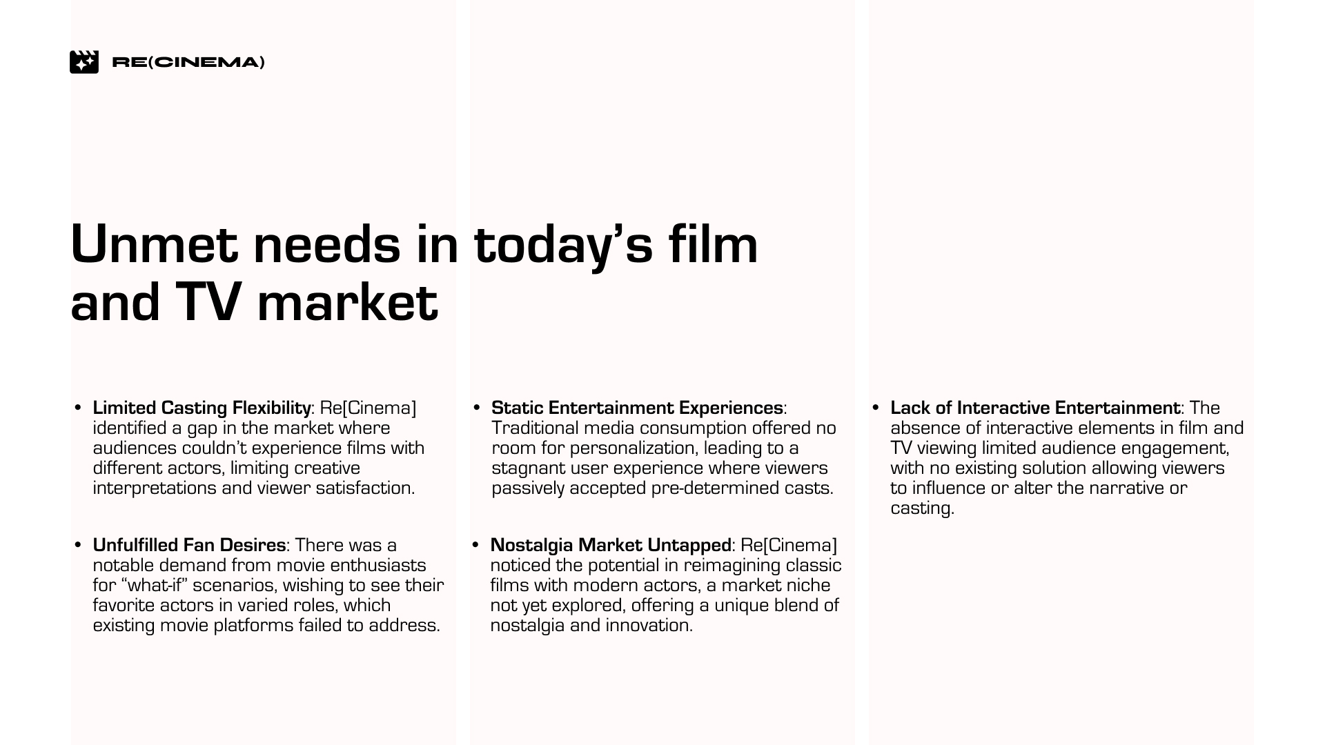
First up: market size.
A concentric circle diagram or a nested circle diagram work wonders to communicate your solution’s reach. These visualizations are great for showing the relationship between different market sizes. Your total addressable market, your serviceable available market, and your serviceable obtainable market should be displayed. Circles are a common motif, but for a more contemporary look, you can also use squares. Either are fine, and equally easy to comprehend. Watch me work!
For the record: pitch decks that show market size without credible sources risk undermining investor confidence. If your data comes from external research or databases, cite them. My examples aren’t meant to be exhaustive of everything a slide might require.
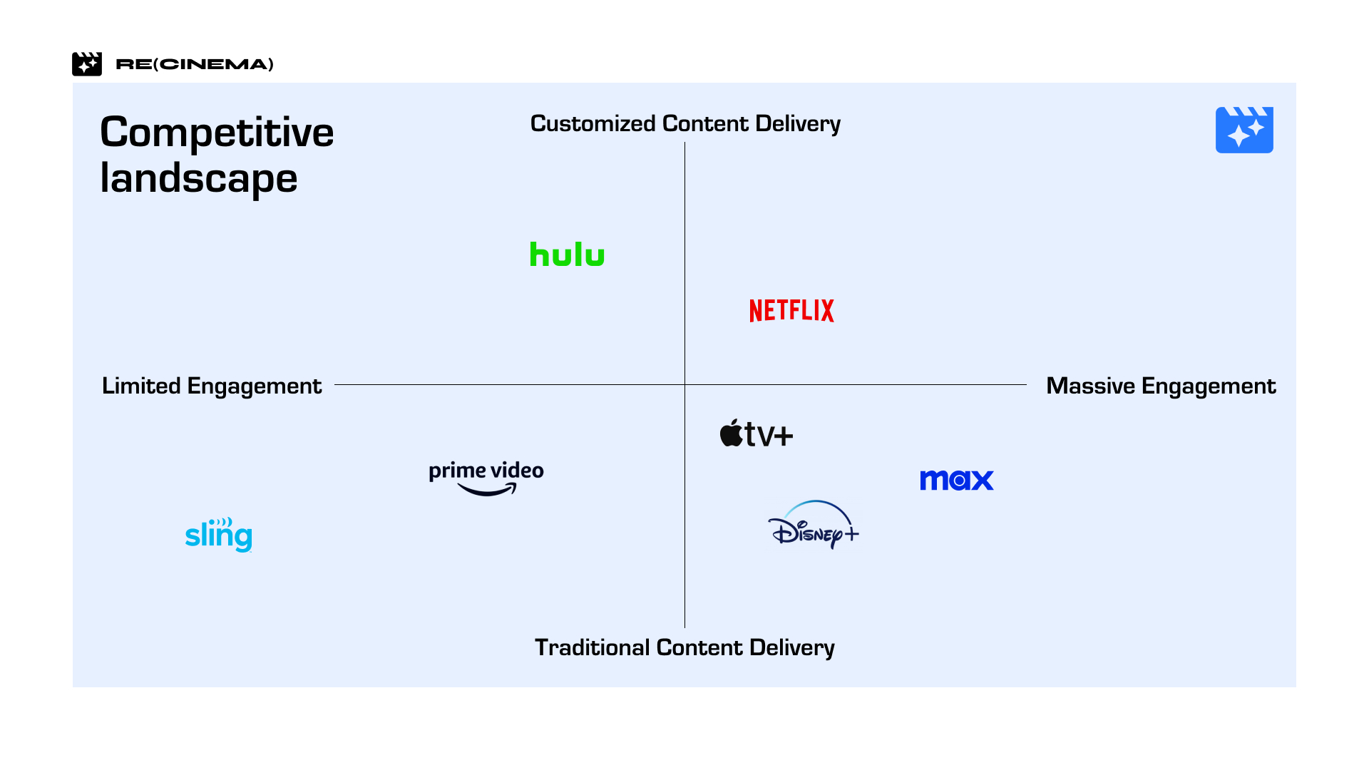
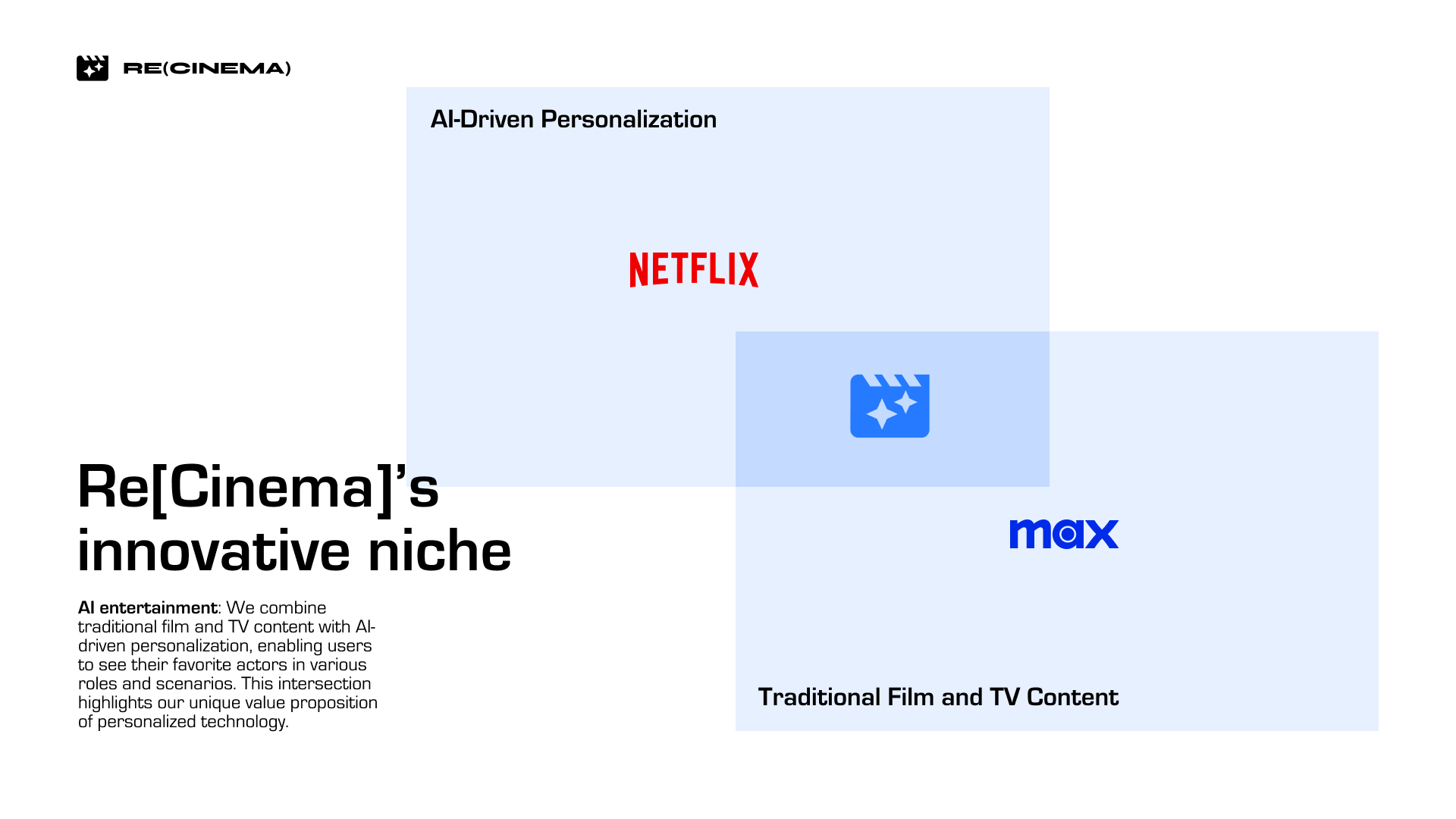
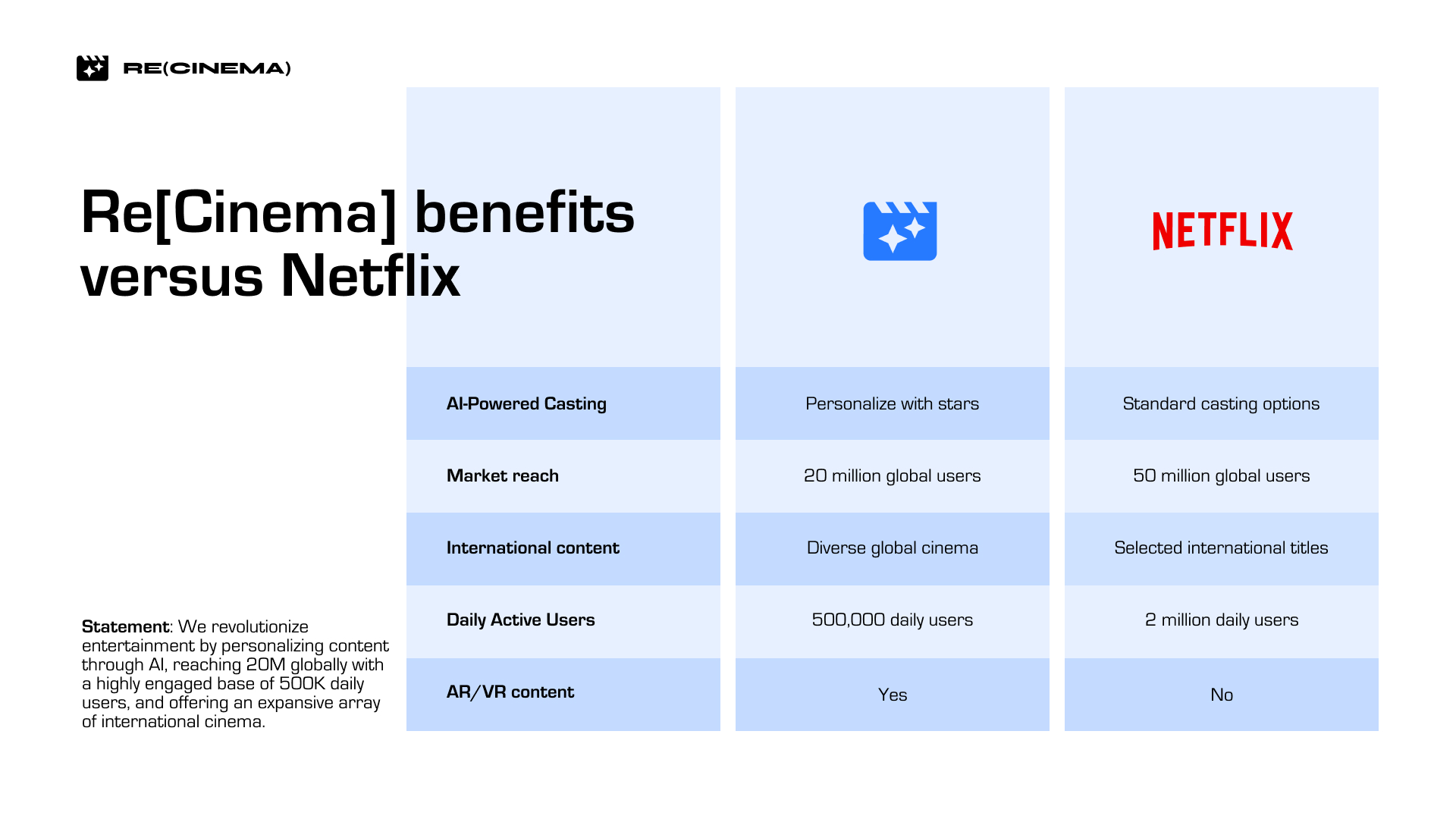
Next, let’s outline the competitive landscape.
Yep, showing logos is common, but it’s also important to focus on the benefits your solution offers. That’s a bit more effective in highlighting how you address market problems and potentially solve other challenges. For this, visualizations like magic quadrants, Venn diagrams, and feature matrices are where it’s at. Here’s what each is good for, and a few tips on how to design them well.
Magic quadrants: These map competitors based on dimensions like innovation and market presence. They’re great at showing when you’re in a niche, or progressive area. When you use these, draw attention to your company so people know exactly where you fit in.
Venn diagrams: use these to show where your product or service overlaps with what the other companies are doing. Limit things to two or three overlapping shapes to avoid confusing the viewer. Venn diagrams don’t have to be an ellipses—see how I’ve used rectangles to do the same thing?
Feature matrices: we all know them… prices, compatibility, customization, etc. are lined up neatly. If you use these, make sure your info catches the eye. Use size, color, or placement to highlight it. Just a heads-up though… these matrices usually focus more on features rather than benefits, which can be a bit less compelling.
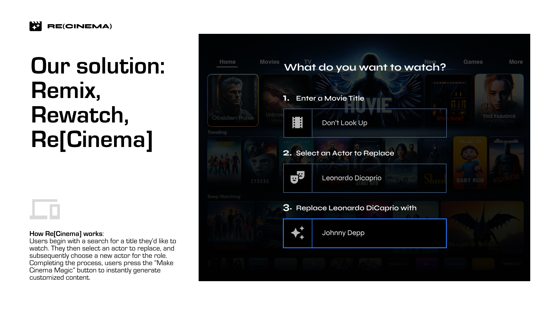
Investors don’t just want data, they want vision.
You’ve likely heard advice against jamming your pitch full of screenshots, as they can obscure your solution with too-small visuals. That’s true. However, a compelling narrative can sometimes require supporting imagery. The following method gives you a way to show what your product or service is about, clearly visible even from across the room. Sleeves are up. Let’s go…
Pretty simple huh? I just focused on the key idea. Now, onto the business model slide.
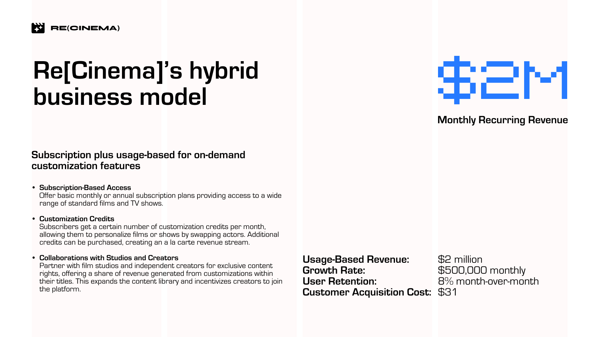
Considering your business model might span from e-commerce to subscriptions and more, there’s an art to showing it. A pitch deck is about showcasing potential, not overwhelming investors with minutiae. Skip the exhaustive lists; what you need are visuals that hit home at a glance. We’re painting a pitch here, not coding a web page!
Below, I laid out Re[Cinema]’s business as hybrid subscription and usage-based. Key info is distilled into plain text, and the page is neatly divided into quarters. Again, divide slides into sections like halves, thirds, etc. to ensure your message comes through, and looks good in the process. Check it out...
Your team’s united front deserves a united look. This is how.
The usual advice: highlight only the founding team or C-suite, as they’re the core of your business. Clearly state their roles and highlight their relevant, seasoned experience using short bios. If your team’s story includes a shared mission or bond, be sure to mention it. Now, for some design tips for more impact with less clutter.
When showing team members from diverse backgrounds, aim for photographic consistency to avoid a ragtag look. Another idea: dress in classic black shirts against a plain background, or simply convert a bunch of disparate photos to black and white for a cohesive look. Demonstrate? That’s my jam!

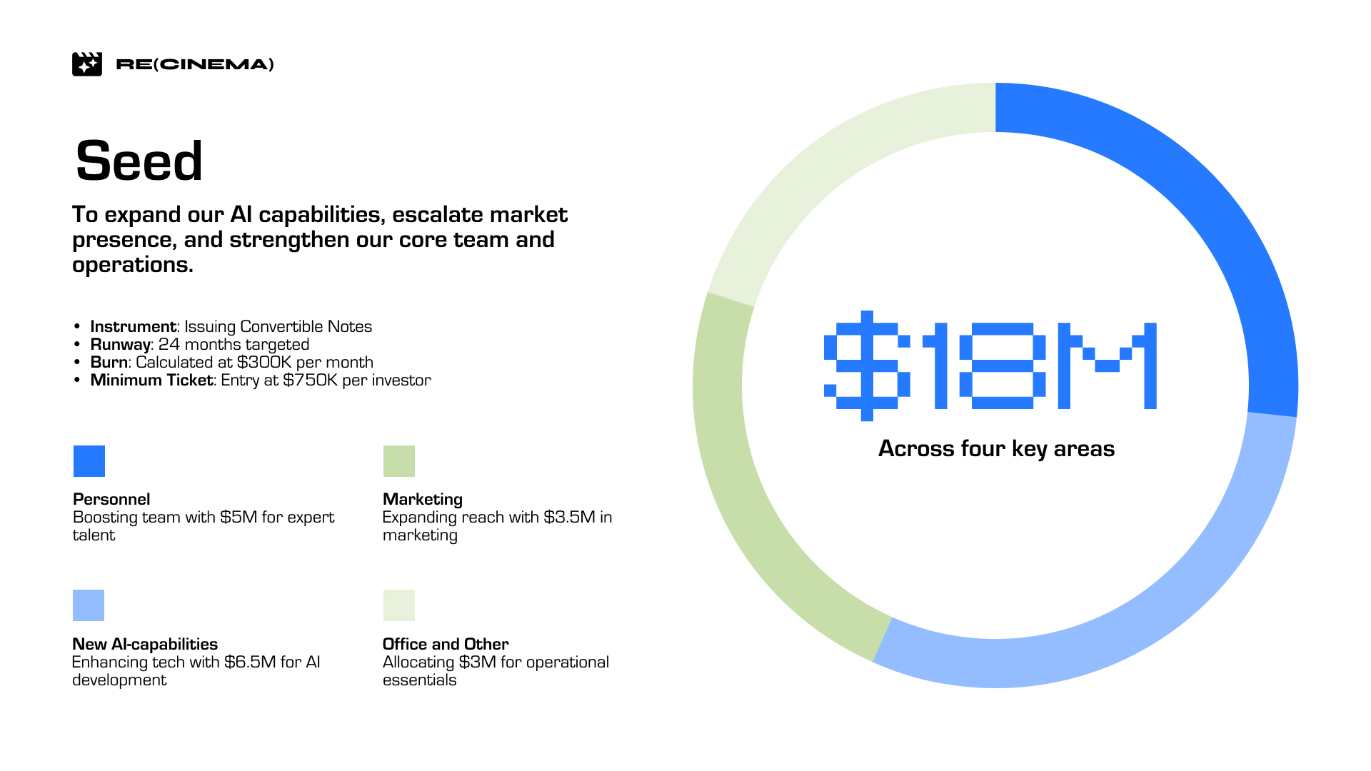
That’s looking like money in the bank, right? Now, let me show you how to ask for it.
Picture this: you’re in the room with top investors—this is the part they’ve been waiting for—keep cool. On this slide, the amount of funding you’re seeking should be immediately clear. Usually, you’ll mention your funding stage, and possibly get into the type of investment you’re thinking about. Past that, it’s not just a number, it’s a breakdown.
See how I’ve used a simple graph with slices to show where the funds are allocated? Pie charts work well when you have data that totals 100%. They show how one thing is enormous (or small) compared to the whole. Limit the number of slices to a reasonable amount and arrange them from largest to smallest for easy comparison.
We’ve covered the essentials. Here are a few extras for those lengthier meetings.
For an investor pitch, it’s common knowledge that there are a few more slides and visualizations you may need to include. From financial projections, to burn rate, to CAC, and more. As well, the way you incorporate these charts can help investors quickly understand your point. Here’s how to craft these common slides so that they pull their design-weight in your pitch.
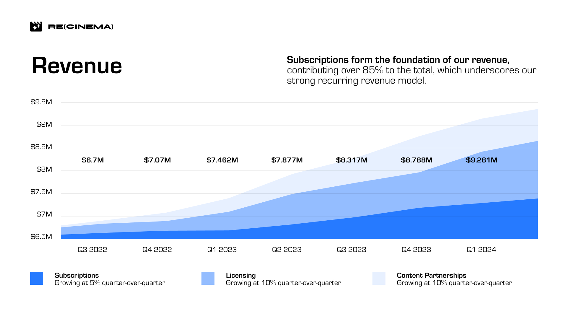
Incorporating area charts effectively.
These charts are used to represent cumulative growth and add a sense of volume to your data. They show changes over time quite well. Be aware though, they aren’t ideal for nuanced comparison, especially when there’s data overlap or a bunch of categories. In those cases, a bar chart is a better bet.
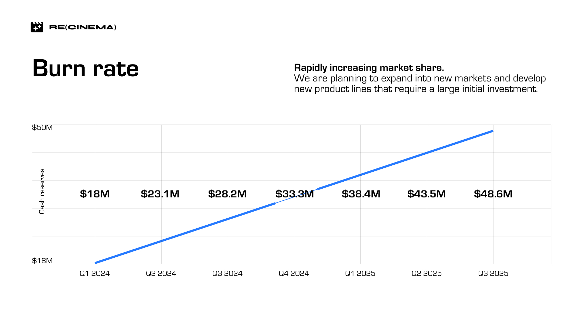
Use line graphs to set the trend.
Here’s your go-to when you want to show trends over time. Below I’ve omitted values along the Y axis to make room for the Cash reserves label. The precise dollar amounts are on each point in the chart already, so the chart still makes sense in aggregate.
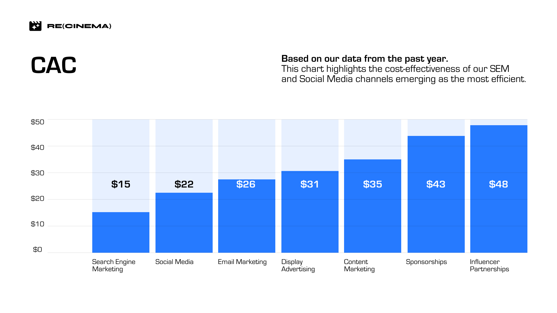
Here’s how to use bar charts like the boss you are.
Each bar represents a segment or time period. Make sure you use clear labels and distinct colors if you use a legend. As well, think about the spacing between bars… too much makes the data look disconnected. Too little makes it look cluttered. Here’s a way to make it look good…
That wraps up my guide to perfecting your pitch.
From setting the stage with a killer first slide to wrapping it up with solid ask and financials, we’ve covered the A to Z of making a pitch deck that gets investors excited. Now, you’re all set to turn heads and (fingers crossed) open wallets. On the design front, if you’re up for trying out the software we designers use, give Figma a go. But, even if you stick to familiar tools like Google Slides, you’ll be all set.
Need a hand putting it all together? Connect with me.
Designing effective, conversion-driven solutions is what I do. Let me elevate your deck from a polite “we’ll be in touch” to an emphatic “let’s schedule our next meeting!” And if I don’t hear from you, good luck in there. But honestly, with a deck like this on your hard drive, you might not even need luck.