Contact
‘Sup
Clients
Portfolio
About
Home
The Standard  •  The Standard

CRAFTING A VISIONARY’S SOCIAL WELLNESS MVP

Chronic sleep deprivation, social isolation, and doom scrolling—modern dilemmas that need solutions. Enter a new platform envisioned to tackle these issues. I transformed a founder’s idea into a tangible design solution for a social platform that connects those with impactful habits, routines, and mindsets to those eager to learn. Here’s how.
3 people icon
Client: The Standard
3 rectangular shapes
Project Type: iOS App
1 person with 4 curved lines surrounding
My Role: UX, UI
Responsive iOS application design of social media feed
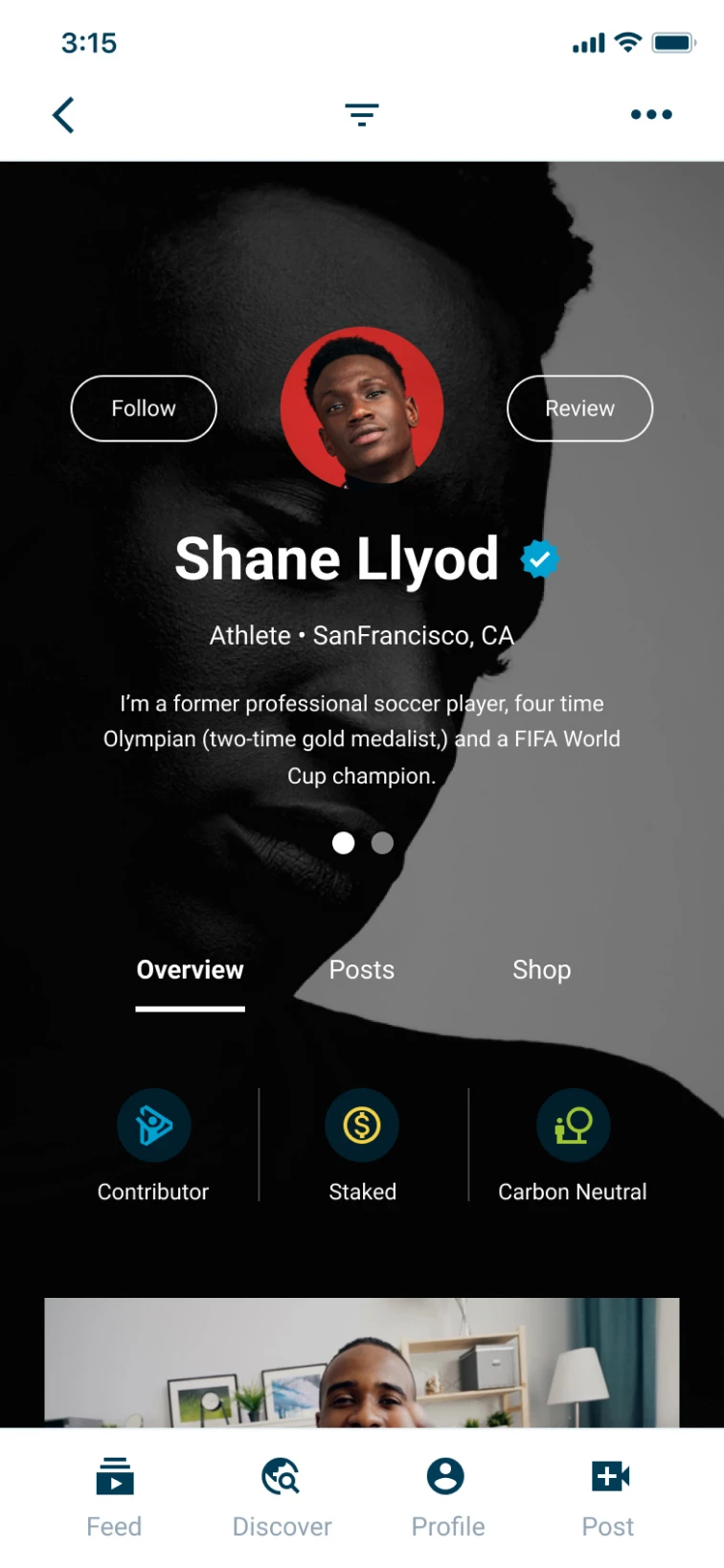
Responsive app design of social media profile
Responsive app design

CHALLENGE AND RESULTS

A place to blend social interaction with personal growth
A platform meant to revolutionize social wellness demanded innovation beyond typical social networks. The challenge lay in evolving a basic directory to a vibrant social ecosystem, without existing precedents. Users can post and watch videos, learn from and inspire others, and monetize a profile, among other things. It goes by The Standard, yet it’s far from ordinary. Up first: the empirical data on my work.
2 black rocks used in spa settings
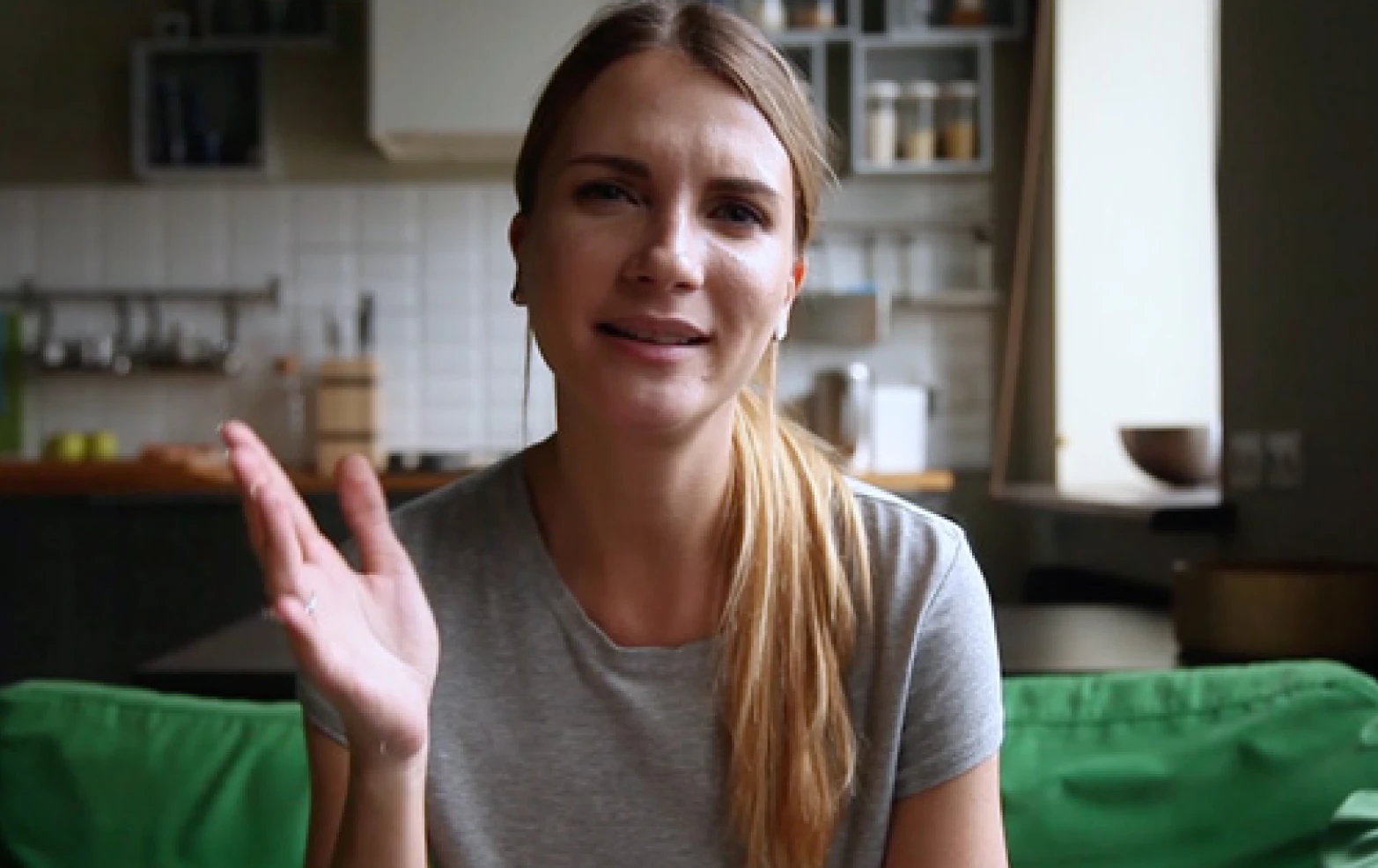
Caucasian woman sitting on green couch talking
Enhanced social capability
I evolved the concept from what was categorically a directory, to a vibrant social ecosystem, increasing projected user interactions and content sharing capabilities.
Inclusivity-driven execution
Incorporating WCAG, I aim to expand the platform’s  reach by 4.5%—on top of its natural reach—underscoring The Standard’s commitment to inclusivity.
User experience transformation
The UX design I created positions the platform in an intuitive and engaging manner, priming it to encourage longer user sessions and greater content interaction.

ASSESSMENT AND FACT-FINDING

Analyzing PowerPoint, Word, and other documents
This project began with an inquiry from the founder to help him reach the next level of fidelity in execution. What he was able to provide me with was a wealth of ideas about the ultimate goal of the platform—to make wellness social, friendly, and accessible to all. Along with this were the beginnings of wireframes and visual design to assess and bring a fresh perspective and new level of execution to. To start, I did a deep dive into these materials, shown in part in the following image.

Creating a Product Roadmap

After this assessment and fact-finding phase, I was able to create a product roadmap that outlined the minimum viable product, minimum sellable product, and minimum lovable product. I used my expertise and understanding of how social platforms and content management systems work to outline the features we’d need. Then, I matched each of the 26 features to one of 5 phases, and assigned a timeline
and cost to those phases. After wrapping up, it was clear that the ultimate vision and the steps to get there would require an entire team. After all, you don’t build social media companies in a few sprints, or alone. So, my work honed in on creating a compelling proof-of-concept, and minimum viable prototype/product to help move the process and idea forward. But enough talk... here’s a snippet of the product roadmap.

Wireframing and Enhancing the User Experience

Armed with a more comprehensive understanding of the goals, this phase naturally revealed new information to act on. One thing I identified was that there wasn’t a strong social component to the platform. It was more akin to a glorified profile or directory that listed different people, daily routines, and their habits. So in this phase, I worked to introduce ways to make it truly social.
Core to the experience I designed is the enhanced process of adopting individuals’ habits, routines, and mindsets—transforming them into actionable steps. This feature, rooted in a preexisting concept, now actively engages the audience (more on this in a minute.) While the project took several weeks and resulted in dozens of wireframes and deliverables, I only have room to share a few screens.
Wireframe of a social media app

VISUALIZING THE STANDARD’S VALUE PROPOSITION

African American man waving at camera taking selfie

The social gamification of wellness

The platform serves Contributors looking to learn and Habiteurs showcasing their expertise. Its gamification aspect sets it apart from typical social networks. Users earn badges for actions that build trust, facilitating learning from each other’s habits, routines, and mindsets.

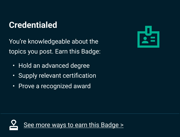
Both Contributors and Habiteurs, despite their different goals, earn badges to level-up their reputation, visibility, and ability to post content on the platform. For example, users can earn badges for qualifying their education, or for environmental actions like driving an electric vehicle.
Gamification content card showing badge that can be earned

Monetizing trust

Achieving a certain level of reputation gives users more capabilities, like creating a profile and monetizing it. This approach lends credence to the importance of building trust on the platform, which is key for learning from each other’s habits, routines, and mindsets. And speaking of habits, routines, and mindsets, here’s a bit more on what that actually means, and how I handled the design.
Responsive social media app design
Habits
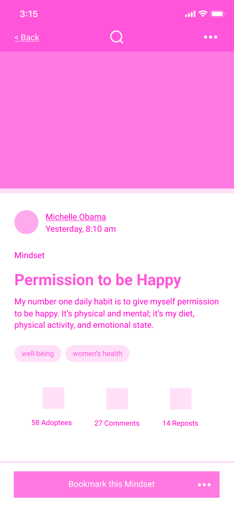
Ritualistic actions that focus on specific outcomes—think a weekly meal prep behavior—are supported by this type of posting.
Responsive social media app design
Routines
These showcase multiple related habits that span a timeframe, like morning through afternoon. A fitness routine is a great example.
Responsive social media app design
Mindsets
Finally, cognitive models that highlight positive ways to think about a topic (like moral dilemmas) can be posted with this interaction.

Using Design Thinking to activate engagement

Circling back to that standout feature I mentioned earlier, I’ve designed the platform to allow users with just a simple tap to adopt any habit, routine, or mindset they choose. This action serves as a catalyst to help people stick with the wellness activities they’re interested in. These next few screens demonstrate with higher fidelity.
UI design for social media app

How data Influenced Design

Qualitative, quantitative, and empirical evidence at play
The original concepts like avoiding giving content a thumbs down, and fostering positive interactions were already part of The Standard’s value proposition. The founder envisioned the platform as a supportive community with only the relevant engagements.

On my end, I dialed into enhancing the platform based on qualitative data and empirical evidence. Specifically, I zeroed in on using quantitative data to refine the user experience, aiming for a projected increase in the user base by an additional 4.5%, on top of its natural reach. Throughout the design, best practices, and WCAG have been incorporated—such as ample color contrast—making the platform capable of reaching more users with better performance.
In-app satisfaction modal with range of smiley faces

Prioritizing Key Application Features

What social network would be complete without a comprehensive feed, a way to discover and search for new profiles, video posting, and monetization mechanisms, to name a few? Not this one. So, I designed this MVP to cater to these features, and several more. Here’s a preview.
UI design for social media app

BEYOND THE MINIMUM VIABLE PRODUCT

3 yellow pills resembling cod liver oil
Woman presenting health drink directly toward viewer

attracting Early Adopters and Investors

Charting The Standard’s future path
The goal from the beginning was to create a compelling proof of concept and MVP to get potential investors excited, and to target influential users as early adopters. To make it happen, I incorporated more screens that hint at these future phases of the project like the Minimum Sellable Product, and Minimum Lovable Product. Beyond the product roadmap, UX, and UI of the platform, I wrote and designed a comprehensive pitch deck too, although it’s not shown in this case study.
In the startup world, the journey to idea validation, funding, and gaining traction is famously long—and The Standard is on that path with zeal. At the time of writing this, and before engineering these designs, they’ve already incorporated some visuals into their marketing website—a design I wasn’t involved in—and launched a podcast series. I invite you to give the high-fidelity prototype a try below. You might soon spot The Standard out in the wild, so keep your eyes peeled. Until then, stay well.
App design with side navigation open
Responsive design with search function demonstrated
UI app design focused on group activities

HIGH FIDELITY PROTOTYPE

Case Study

Up Next

B2C