BUILDING A DESIGN SYSTEM THAT BUILDS TRUST
The other half of the work
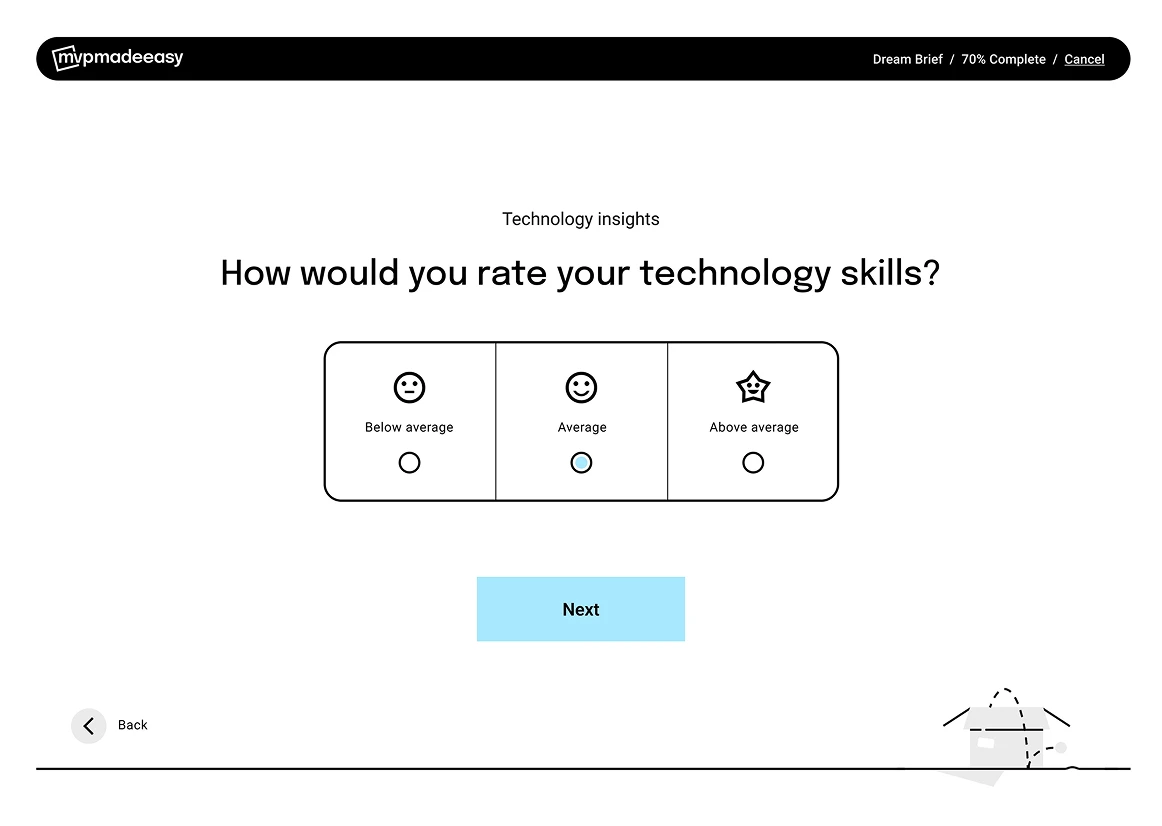
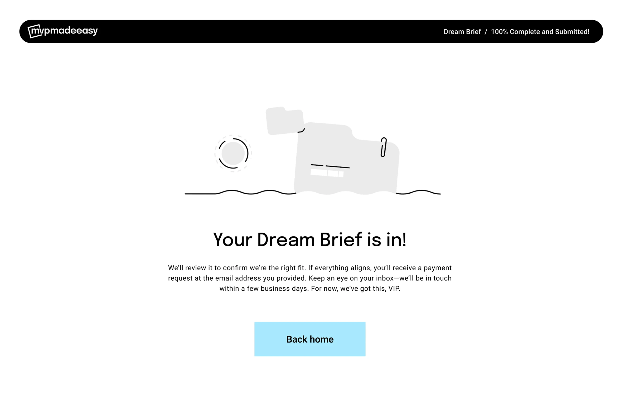
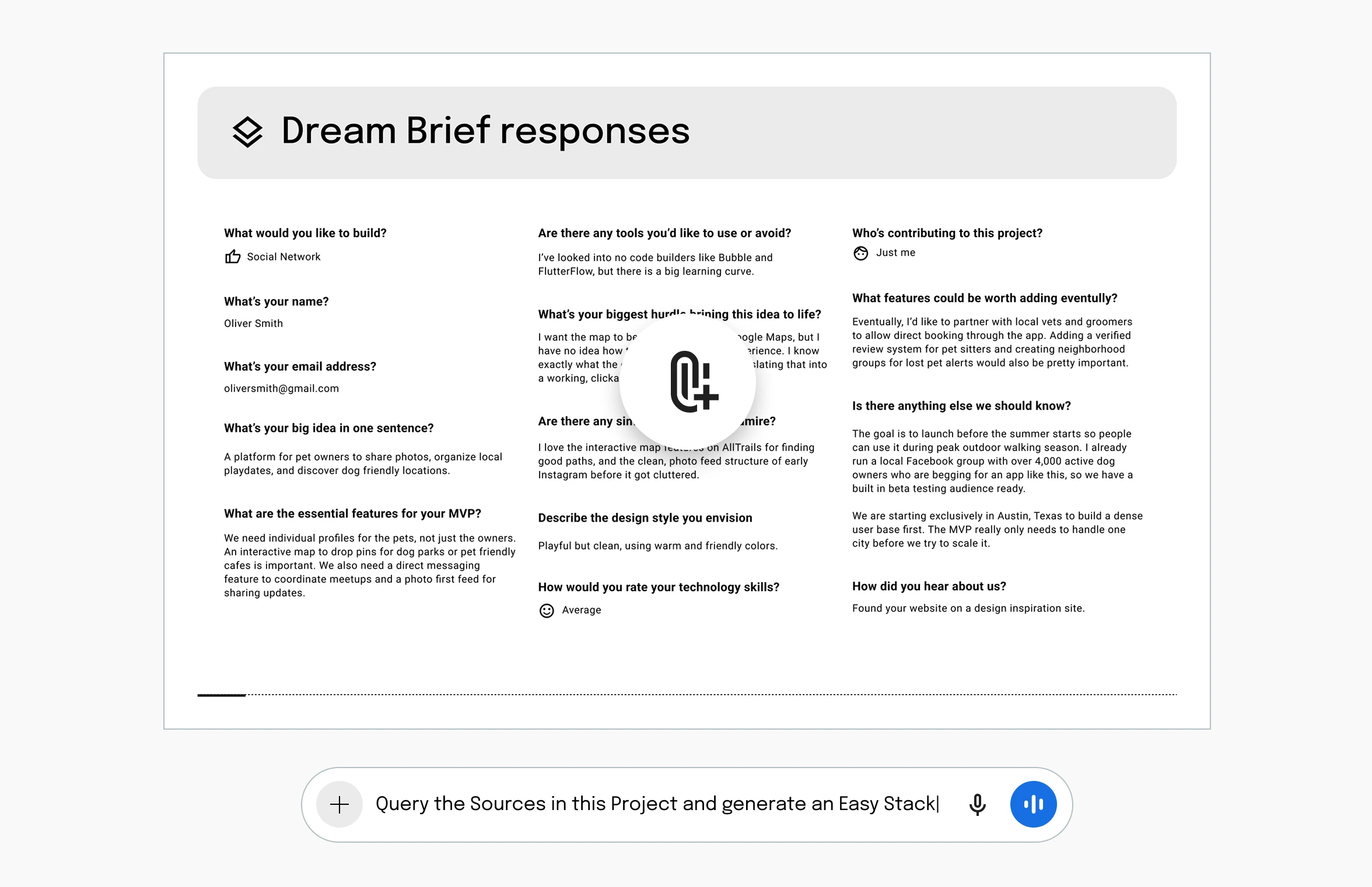
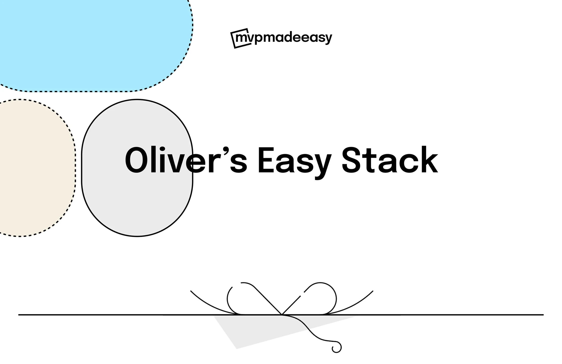
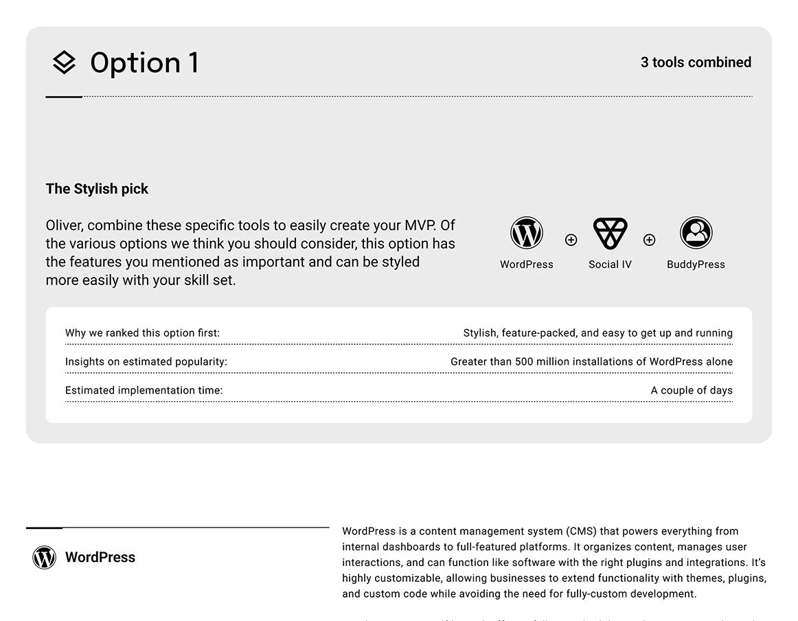
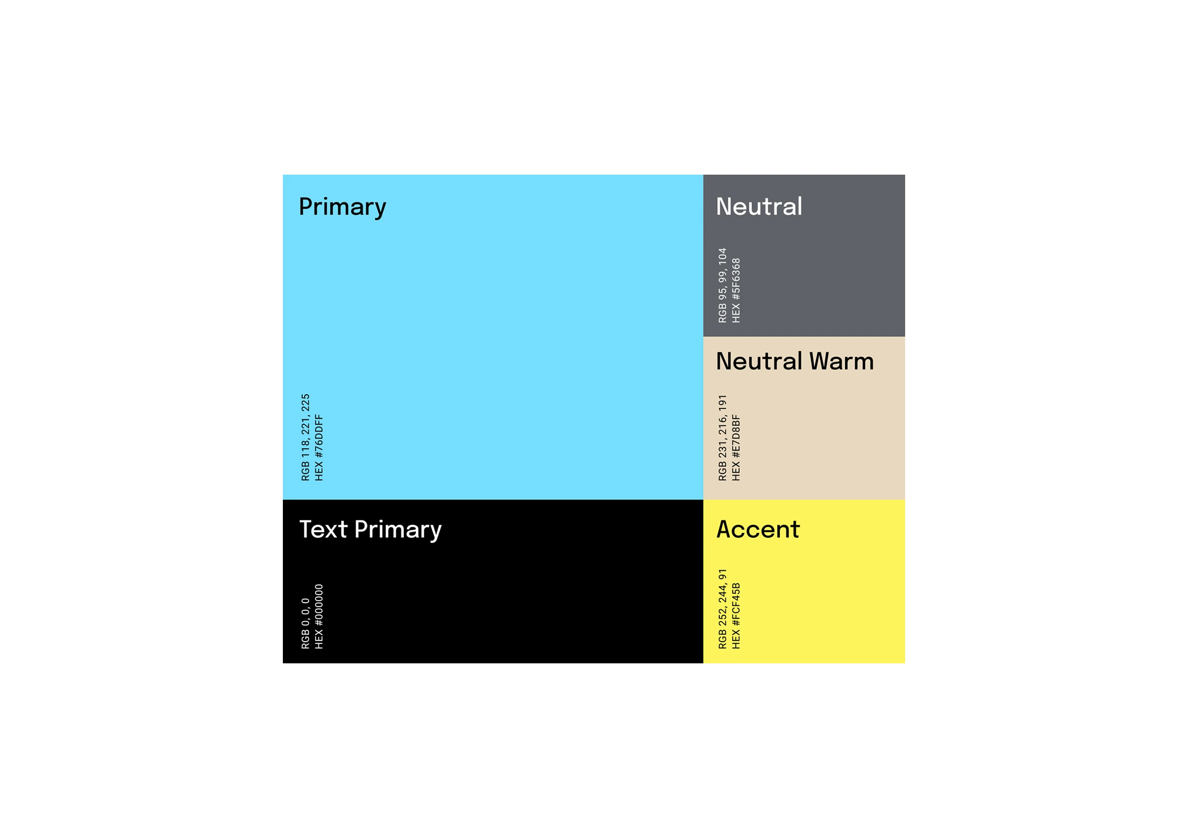
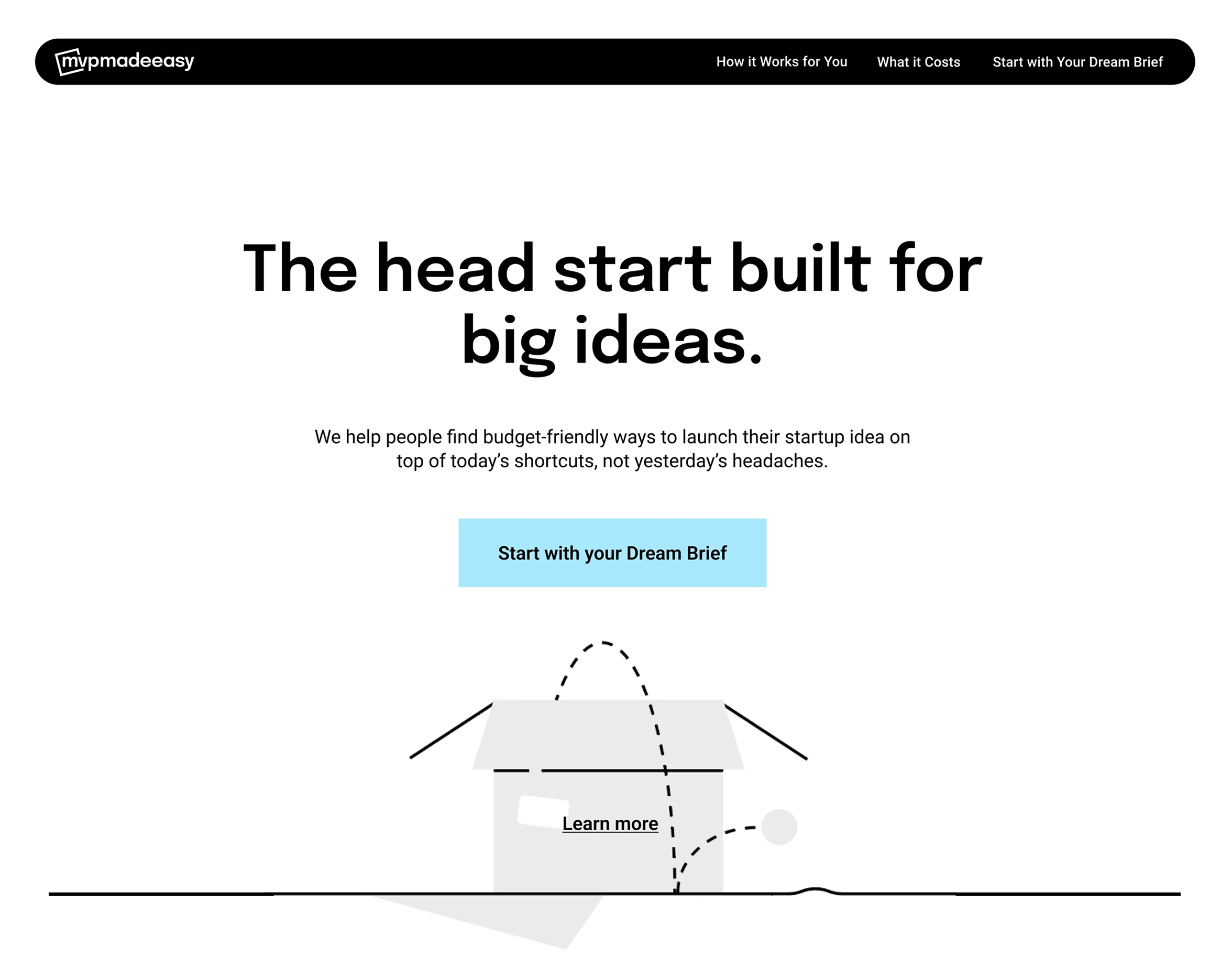
Launching an idea takes more than a solid approach. You have to look the part, and strong design helps get there fast. While most of this case study focuses on product strategy, nearly twenty years of experience means I’m just as fluent in high-fidelity execution. I used that range to craft a sharp logo, custom line illustrations, and a clean, cohesive color palette. The result signals a premium experience before a founder even submits their first idea.
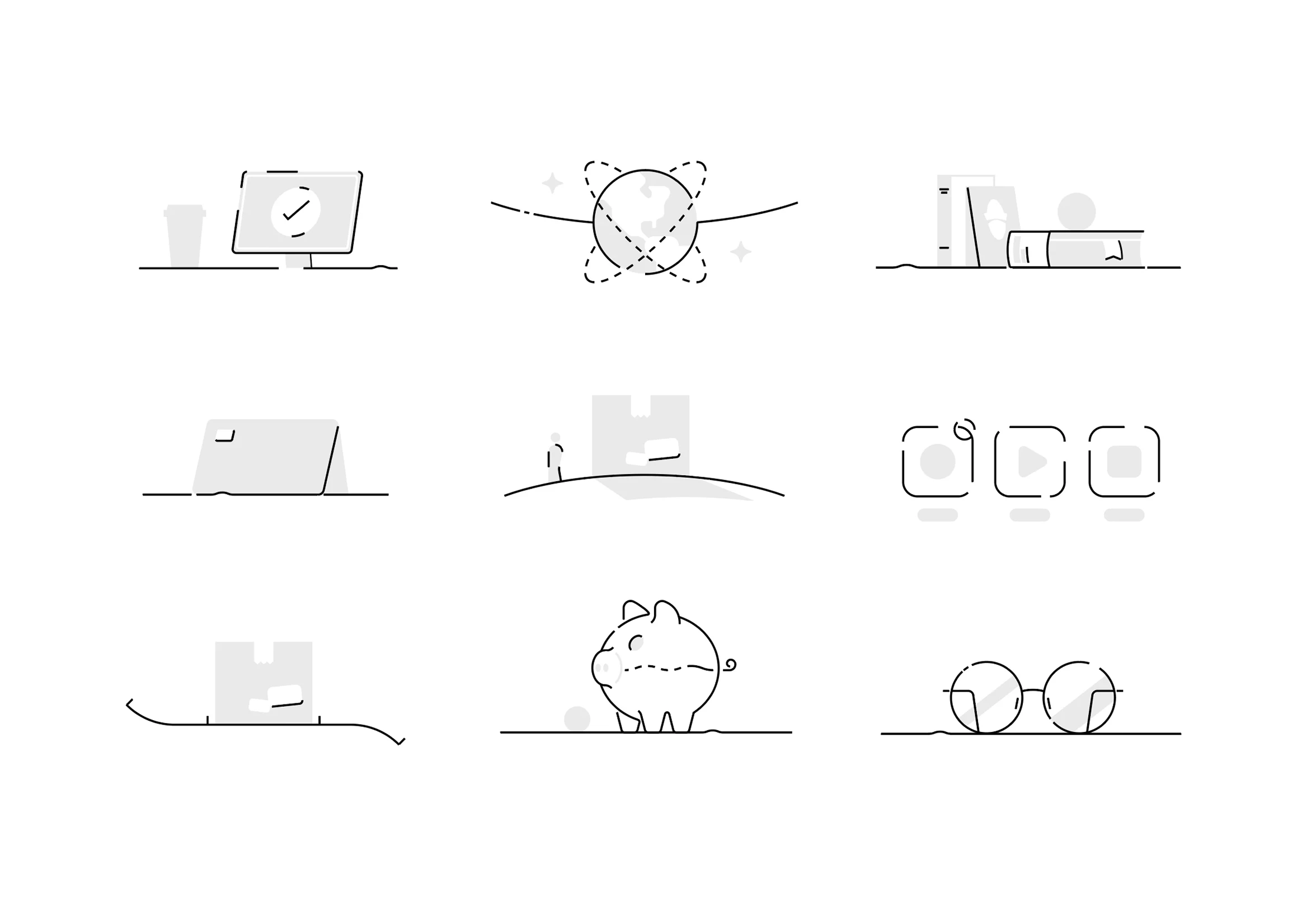
Adaptive strokes: A sample of the assets I illustrated. They use variable weights to scale from bold to hairline as needed.
A nod toward the Model Context Protocol
As for the design system, I’ve learned the importance of semantic naming conventions. What caught my attention recently is how emerging frameworks like the Figma Model Context Protocol rely on this exact architecture to automate design systems. That standard is influencing how I think about larger enterprise work.